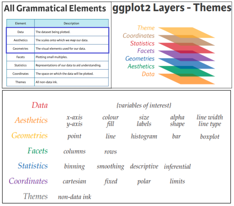
09: Data visualization with ggplot2
What is ggplot2?
- ggplot2 is part of the tidyverse, a set of packages created by Hadley Wickham.
- ggplot2 implements a grammar of graphics to enable creation of plots from modular building blocks
- ggplot2 is designed to work with tidy data (we’ll get into this later today).
Graph components
- Plots in ggplot2 consist of 3 main components:
- Data: The dataset being summarized
- Aesthetic mapping: Variables mapped to visual cues, such as x-axis and y-axis values and colors
- Geometry: The type of plot (scatterplot, boxplot, barplot, histogram, qqplot, smooth density, etc.)
ggplot(data = <DATA>, mapping = aes(<MAPPINGS>)) + <GEOM_FUNCTION>()
Graph components
geoms
geom_point() for scatter plots, dot plots, etc.geom_histogram() for histogramsgeom_boxplot() for, well, boxplots!geom_line() for trend lines, time series, etc.- and many more …
Graph components
- There are additional components:
- Scale
- Labels, Title, Legend
- Theme/Style
Graph components
![]()
Our dataset
Expression matrix from the mouse influenza experiment
library(tidyverse)

rnaseq_file = "https://raw.githubusercontent.com/maxplanck-ie/Rintro/refs/heads/2025.04/qmd/data/rnaseq_counts_wide.csv"

rna = read_csv(rnaseq_file)

rna
# A tibble: 1,474 × 23
   gene    GSM2545336 GSM2545337 GSM2545338 GSM2545339 GSM2545340 GSM2545341
   <chr>        <dbl>      <dbl>      <dbl>      <dbl>      <dbl>      <dbl>
 1 Asl           1170        361        400        586        626        988
 2 Apod         36194      10347       9173      10620      13021      29594
 3 Cyp2d22       4060       1616       1603       1901       2171       3349
 4 Klk6           287        629        641        578        448        195
 5 Fcrls           85        233        244        237        180         38
 6 Slc2a4         782        231        248        265        313        786
 7 Exd2          1619       2288       2235       2513       2366       1359
 8 Gjc2           288        595        568        551        310        146
 9 Plp1         43217     101241      96534      58354      53126      27173
10 Gnb4          1071       1791       1867       1430       1355        798
# ℹ 1,464 more rows
# ℹ 16 more variables: GSM2545342 <dbl>, GSM2545343 <dbl>, GSM2545344 <dbl>,
#   GSM2545345 <dbl>, GSM2545346 <dbl>, GSM2545347 <dbl>, GSM2545348 <dbl>,
#   GSM2545349 <dbl>, GSM2545350 <dbl>, GSM2545351 <dbl>, GSM2545352 <dbl>,
#   GSM2545353 <dbl>, GSM2545354 <dbl>, GSM2545362 <dbl>, GSM2545363 <dbl>,
#   GSM2545380 <dbl>
Our dataset
Let’s plot a MA-like plot for GSM2545336 vs GSM2545380, first, we generate the tibble as:
# log2fc:     M = log2(x/y) = log2(x) - log2(y)
# norm_mean:  A = 1/2 ( log2(x) + log2(y) )
ma_data = rna %>%
          select(gene, GSM2545336, GSM2545380) %>%
          mutate(
              norm_mean = ( log2(GSM2545336 + 1) + log2(GSM2545380 + 1) ) / 2,
              log2fc = log2(GSM2545336 + 1) - log2(GSM2545380 + 1)
            ) %>%
            select(gene, log2fc, norm_mean)
ma_data
# A tibble: 1,474 × 3
   gene      log2fc norm_mean
   <chr>      <dbl>     <dbl>
 1 Asl     -0.0269      10.2
 2 Apod    -0.0759      15.2
 3 Cyp2d22  0.0146      12.0
 4 Klk6     0.148        8.10
 5 Fcrls    0.318        6.27
 6 Slc2a4  -0.0256       9.63
 7 Exd2    -0.0653      10.7
 8 Gjc2     0.136        8.11
 9 Plp1     0.386       15.2
10 Gnb4     0.00810     10.1
# ℹ 1,464 more rows
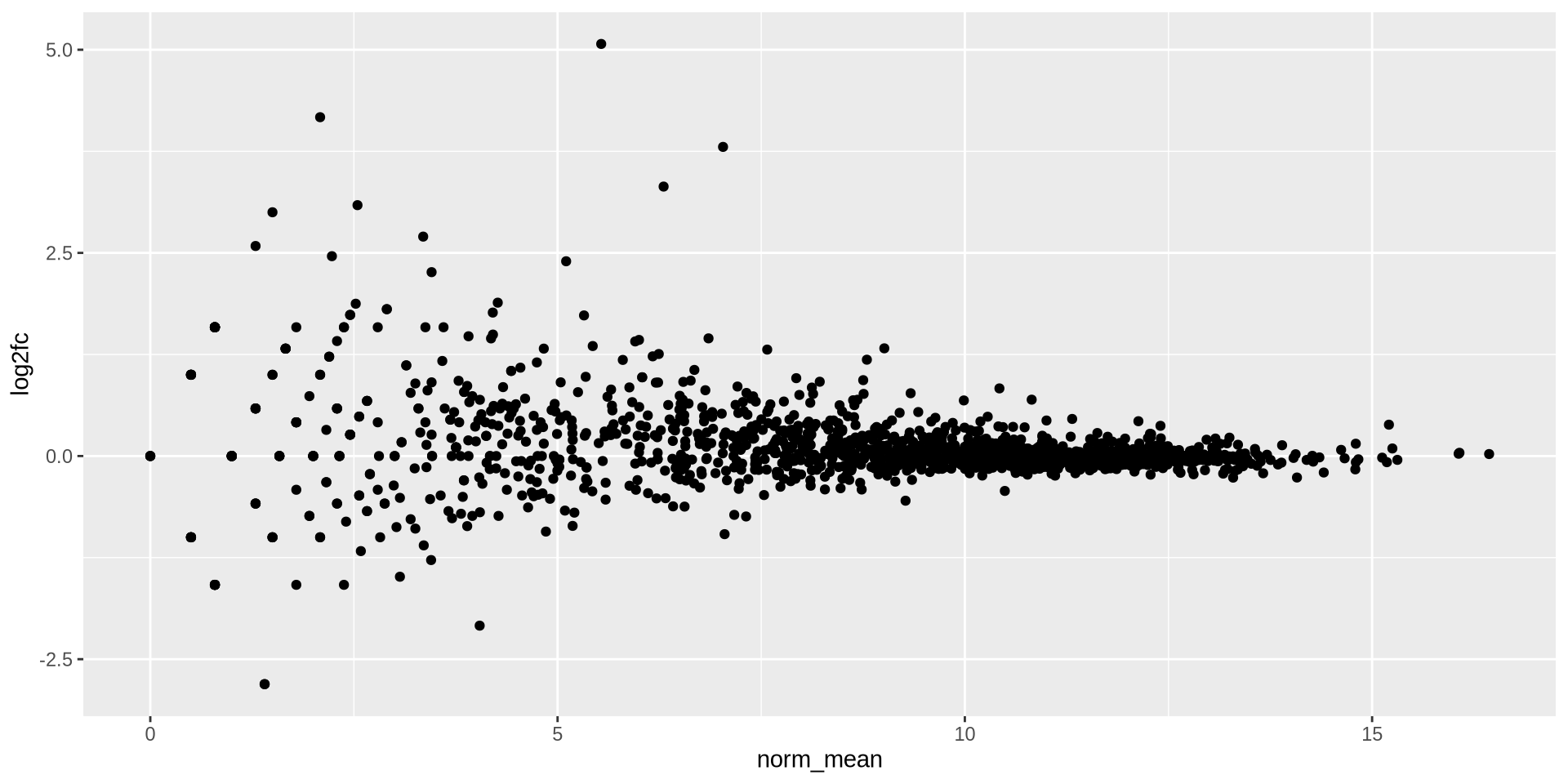
ggplot2 in action - geom_point()
geom_point() are basic scatter plots
ggplot(ma_data, aes(x = norm_mean, y = log2fc)) +
  geom_point()
![]()
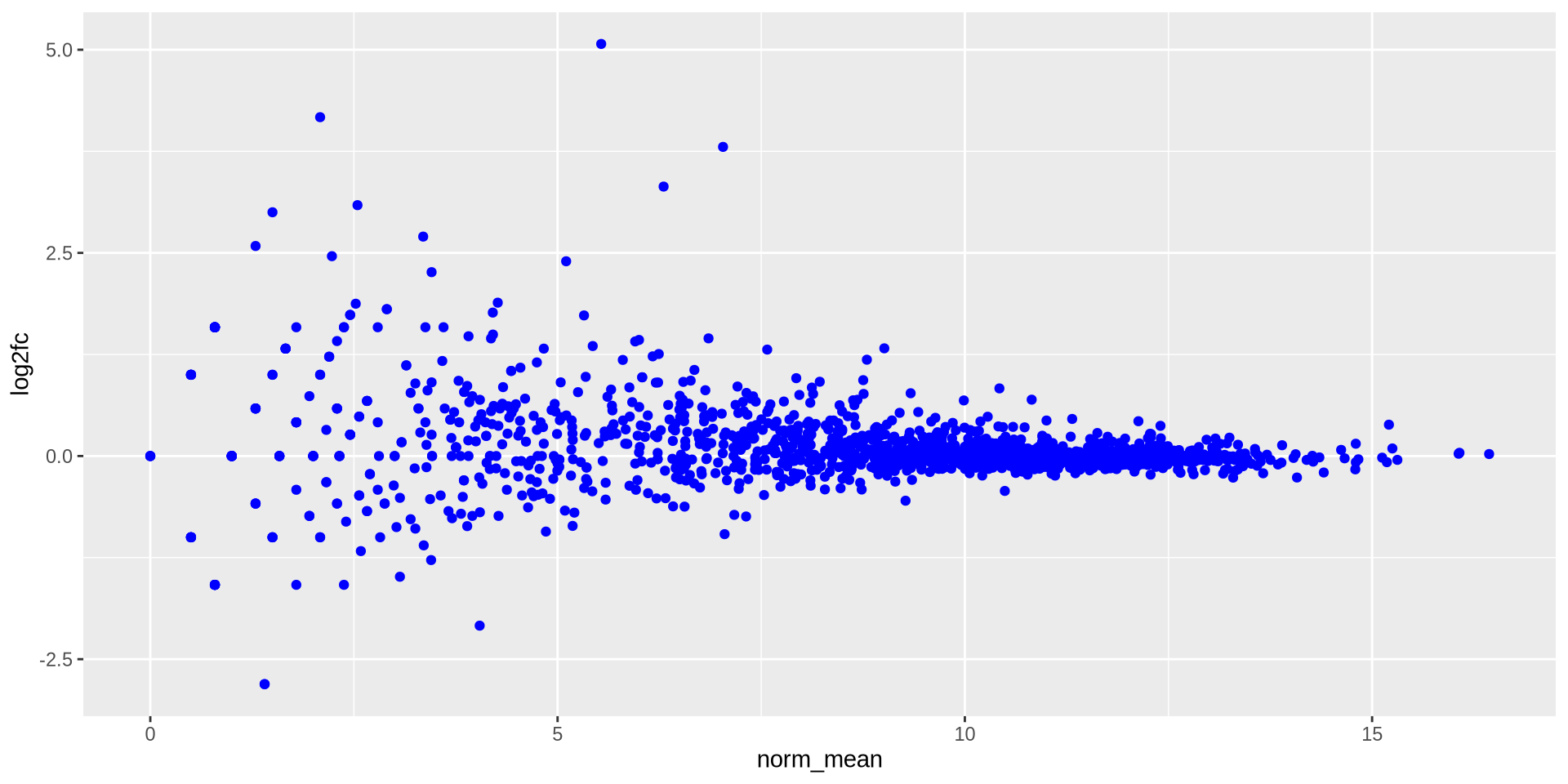
ggplot2 in action - geom_point()
We can modify graphic elements, for color
ggplot(ma_data, aes(x = norm_mean, y = log2fc)) +
  geom_point(color = 'blue')
![]()
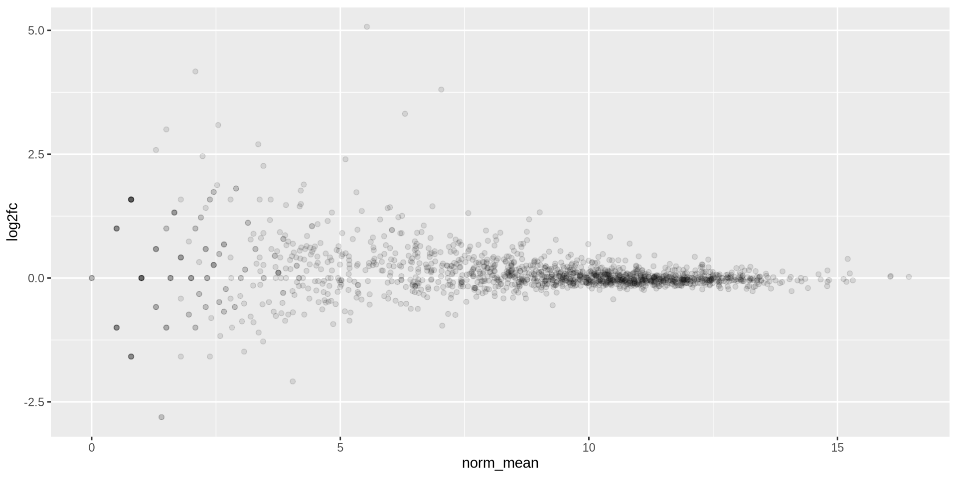
ggplot2 in action - geom_point()
Overplotting can be fixed using transparency with alpha
ggplot(ma_data, aes(x = norm_mean, y = log2fc)) +
  geom_point(alpha = 0.1)
![]()
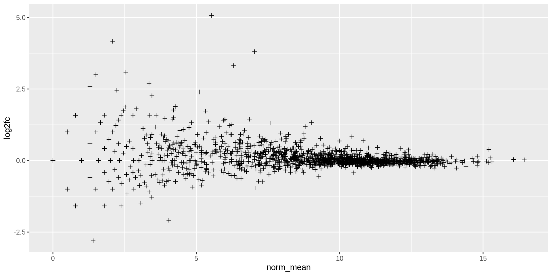
ggplot2 in action - geom_point()
Point marks can be changed with shape, the numbers are predefined forms
ggplot(ma_data, aes(x = norm_mean, y = log2fc)) +
  geom_point(shape = 3)
![]()
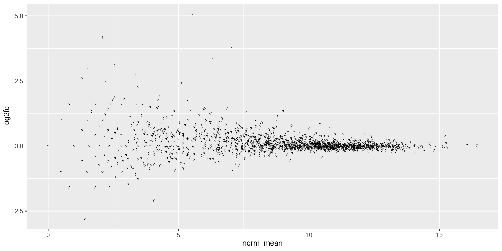
ggplot2 in action - geom_point()
shape also accept any char
ggplot(ma_data, aes(x = norm_mean, y = log2fc)) +
  geom_point(shape = '?')
![]()
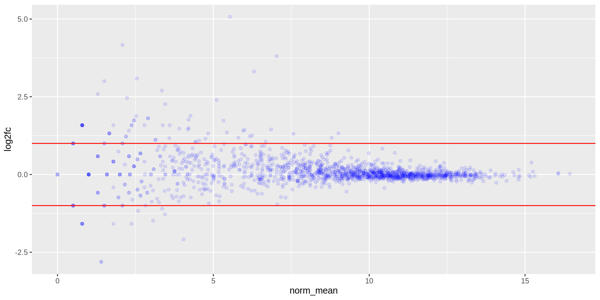
ggplot2 in action - geom_point()
We can overlap new elements, such as an horizontal line geom_hline()
ggplot(ma_data, aes(x = norm_mean, y = log2fc)) +
  geom_point(color = 'blue', alpha = 0.1) +
  geom_hline(yintercept =  1, color = 'red') +
  geom_hline(yintercept = -1, color = 'red')
![]()
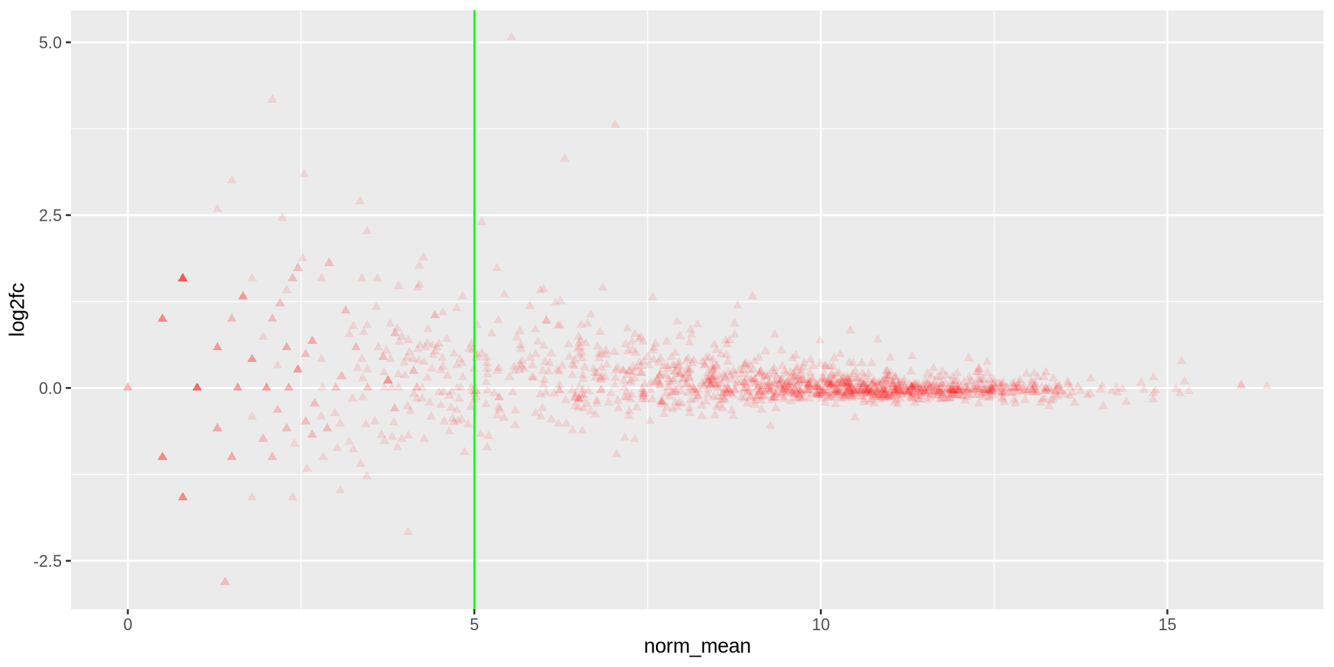
Hands on
Generate a similar plot comparing another 2 samples, use red “triangles” as points with a vertical green line in norm_mean = 5
Hands on
ggplot(ma_data, aes(x = norm_mean, y = log2fc)) +
  geom_point(color = 'red', shape = 17, alpha = 0.1) +
  geom_vline(xintercept = 5, color = 'green')
![]()
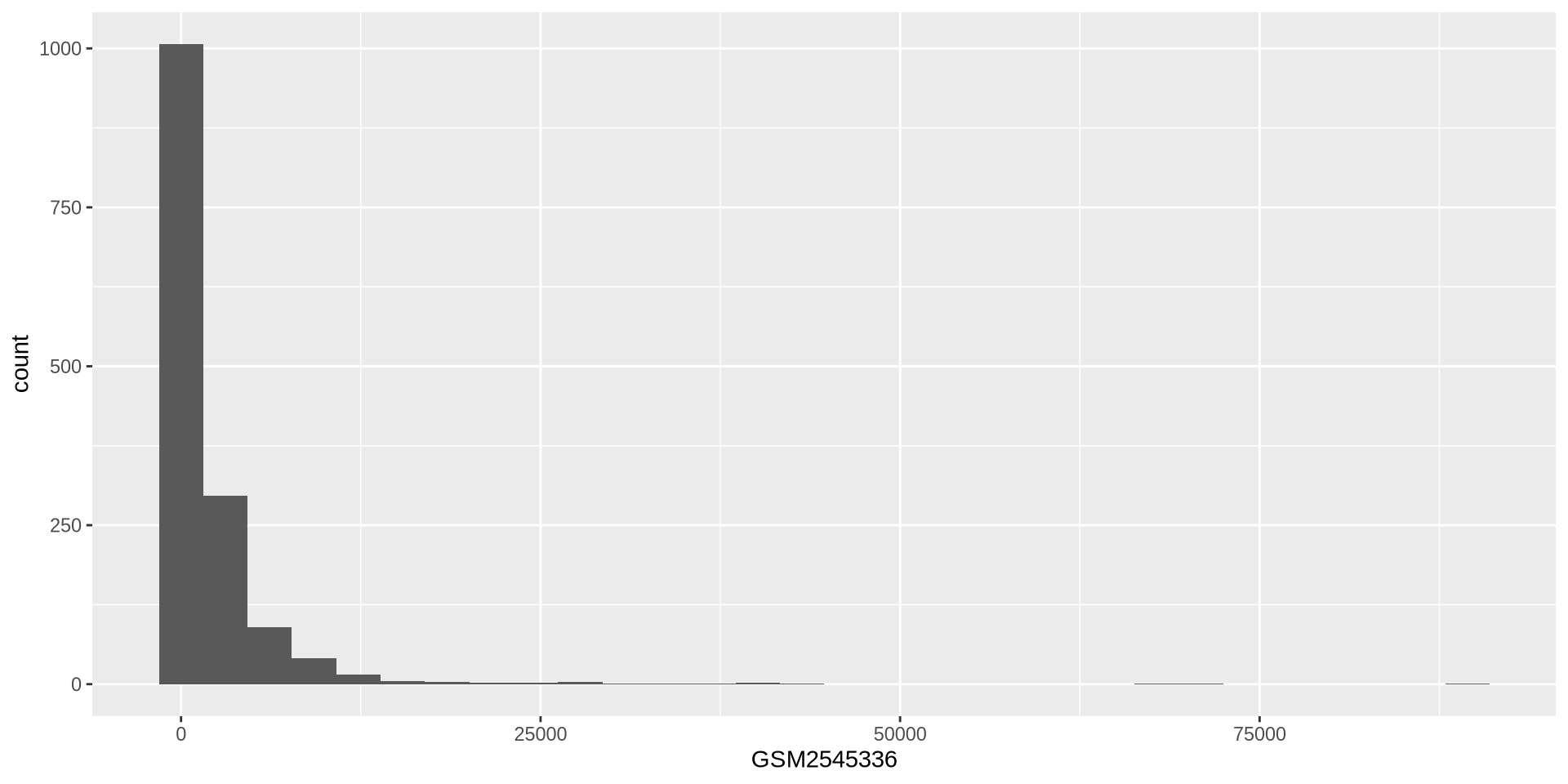
ggplot2 in action - geom_histogram()
Histogram of expression values for sample GSM2545336
ggplot(rna, aes(x = GSM2545336)) +
  geom_histogram()
![]()
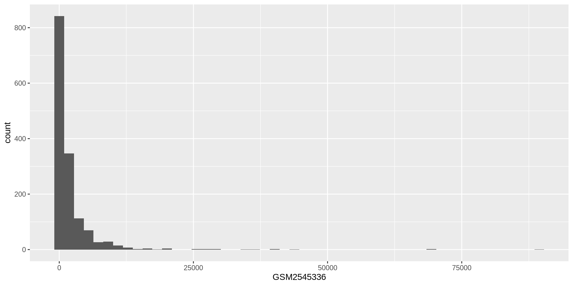
ggplot2 in action - geom_histogram()
We can adjust the histogram bins
ggplot(rna, aes(x = GSM2545336)) +
  geom_histogram(bins = 50)
![]()
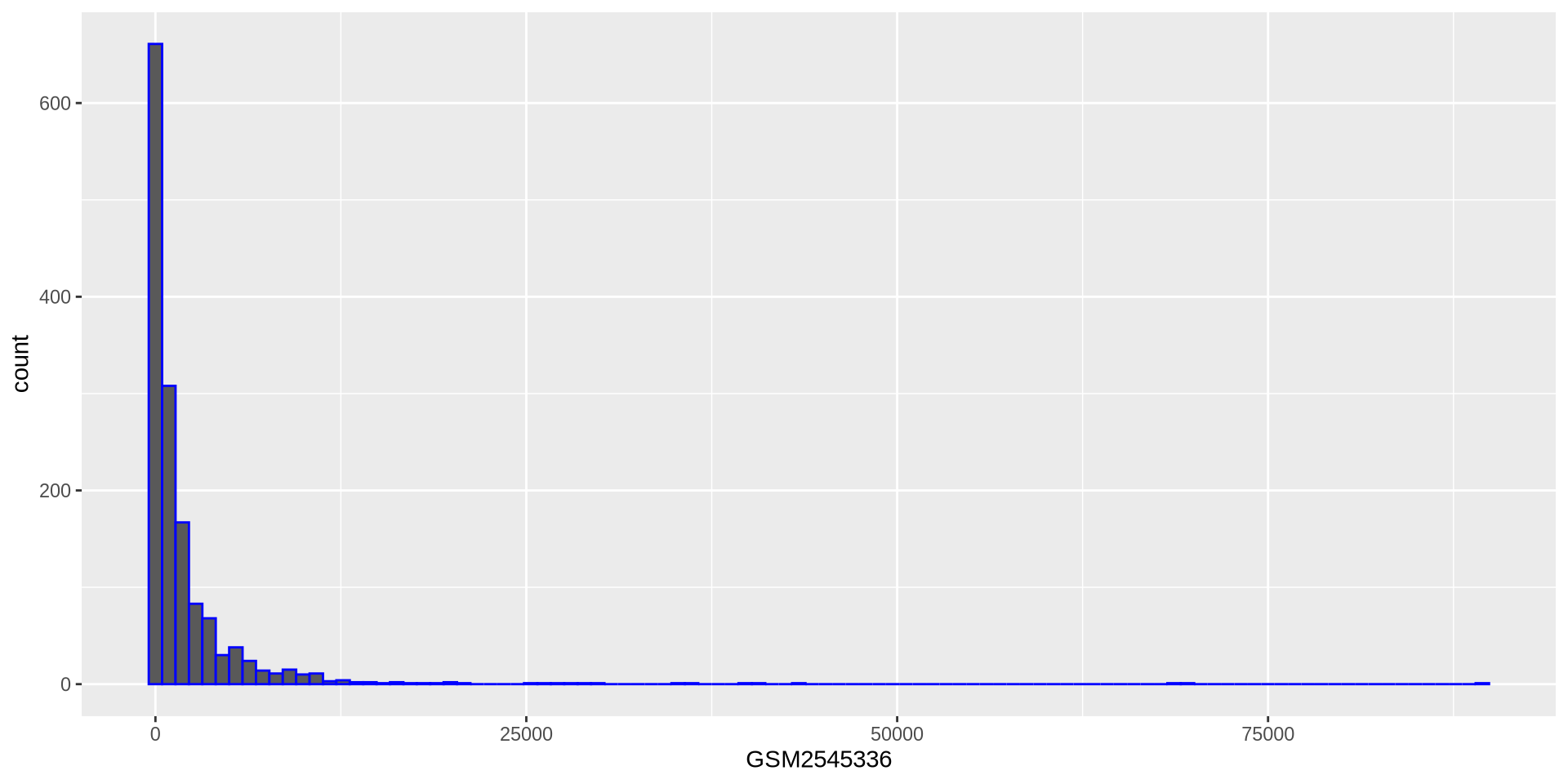
ggplot2 in action - geom_histogram()
We can use a variable to store a template
# Assign plot to a variable
hist_plot = ggplot(rna, aes(x = GSM2545336))
# Draw the plot
hist_plot + geom_histogram(bins = 100, color = 'blue')
![]()
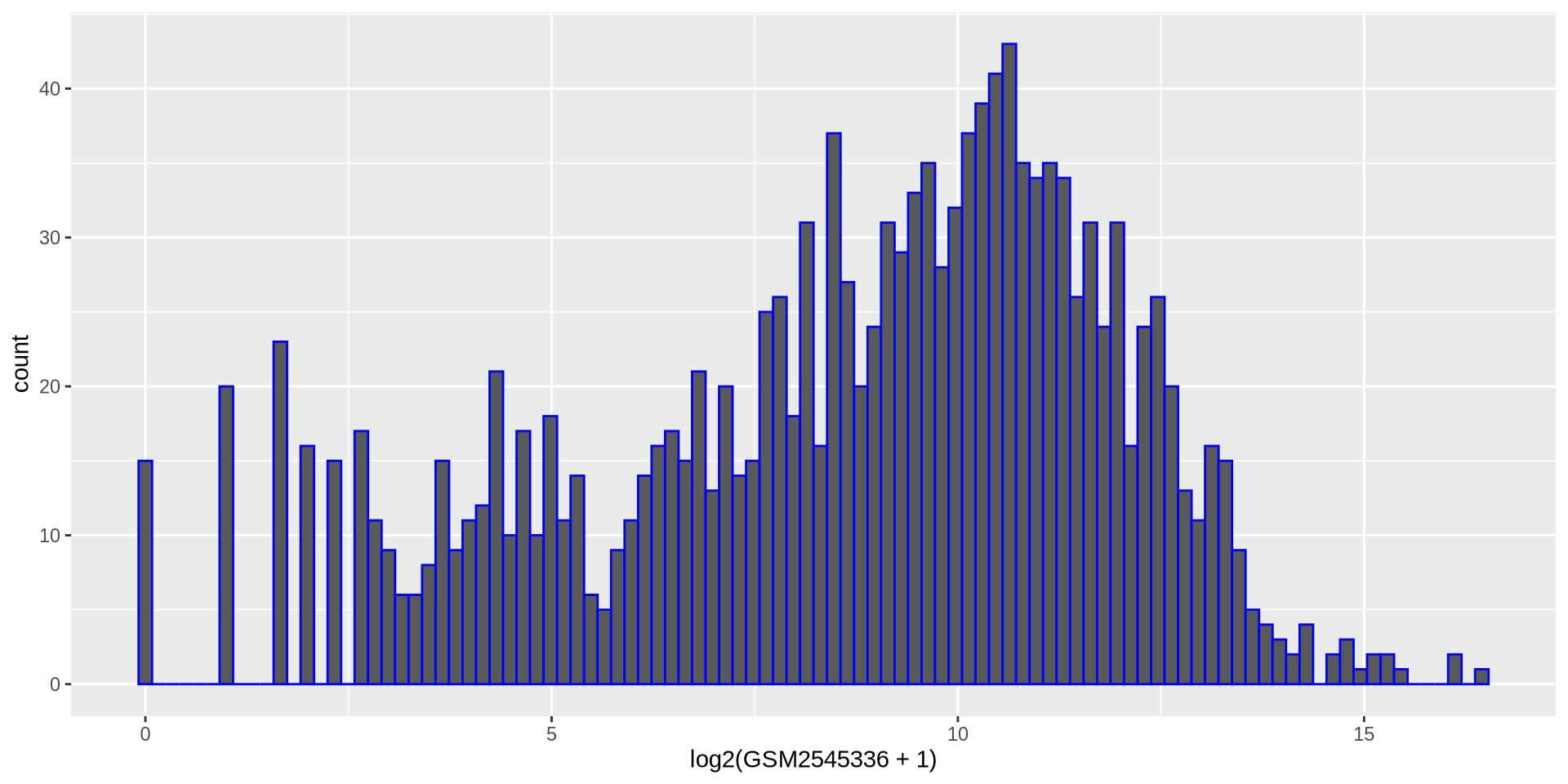
Hands on
Create a new histogram for another sample values but in log2 scale
Hands on
hist_plot = ggplot(rna, aes(x = log2(GSM2545336 + 1)))
hist_plot + geom_histogram(bins = 100, color = 'blue')
![]()
New dataset
rnaseq.csv is the long-format for the mouse influenza experiment. Let’s add a log2-expression column
rnaseq_file = "https://raw.githubusercontent.com/maxplanck-ie/Rintro/refs/heads/2025.04/qmd/data/rnaseq.csv"
rna_data = read_csv(rnaseq_file)
rna_long = rna_data %>%
           mutate(expression_log = log2(expression + 1))
rna_long
# A tibble: 32,428 × 20
   gene    sample  expression organism   age sex   infection strain  time tissue
   <chr>   <chr>        <dbl> <chr>    <dbl> <chr> <chr>     <chr>  <dbl> <chr>
 1 Asl     GSM254…       1170 Mus mus…     8 Fema… Influenz… C57BL…     8 Cereb…
 2 Apod    GSM254…      36194 Mus mus…     8 Fema… Influenz… C57BL…     8 Cereb…
 3 Cyp2d22 GSM254…       4060 Mus mus…     8 Fema… Influenz… C57BL…     8 Cereb…
 4 Klk6    GSM254…        287 Mus mus…     8 Fema… Influenz… C57BL…     8 Cereb…
 5 Fcrls   GSM254…         85 Mus mus…     8 Fema… Influenz… C57BL…     8 Cereb…
 6 Slc2a4  GSM254…        782 Mus mus…     8 Fema… Influenz… C57BL…     8 Cereb…
 7 Exd2    GSM254…       1619 Mus mus…     8 Fema… Influenz… C57BL…     8 Cereb…
 8 Gjc2    GSM254…        288 Mus mus…     8 Fema… Influenz… C57BL…     8 Cereb…
 9 Plp1    GSM254…      43217 Mus mus…     8 Fema… Influenz… C57BL…     8 Cereb…
10 Gnb4    GSM254…       1071 Mus mus…     8 Fema… Influenz… C57BL…     8 Cereb…
# ℹ 32,418 more rows
# ℹ 10 more variables: mouse <dbl>, ENTREZID <dbl>, product <chr>,
#   ensembl_gene_id <chr>, external_synonym <chr>, chromosome_name <chr>,
#   gene_biotype <chr>, phenotype_description <chr>,
#   hsapiens_homolog_associated_gene_name <chr>, expression_log <dbl>
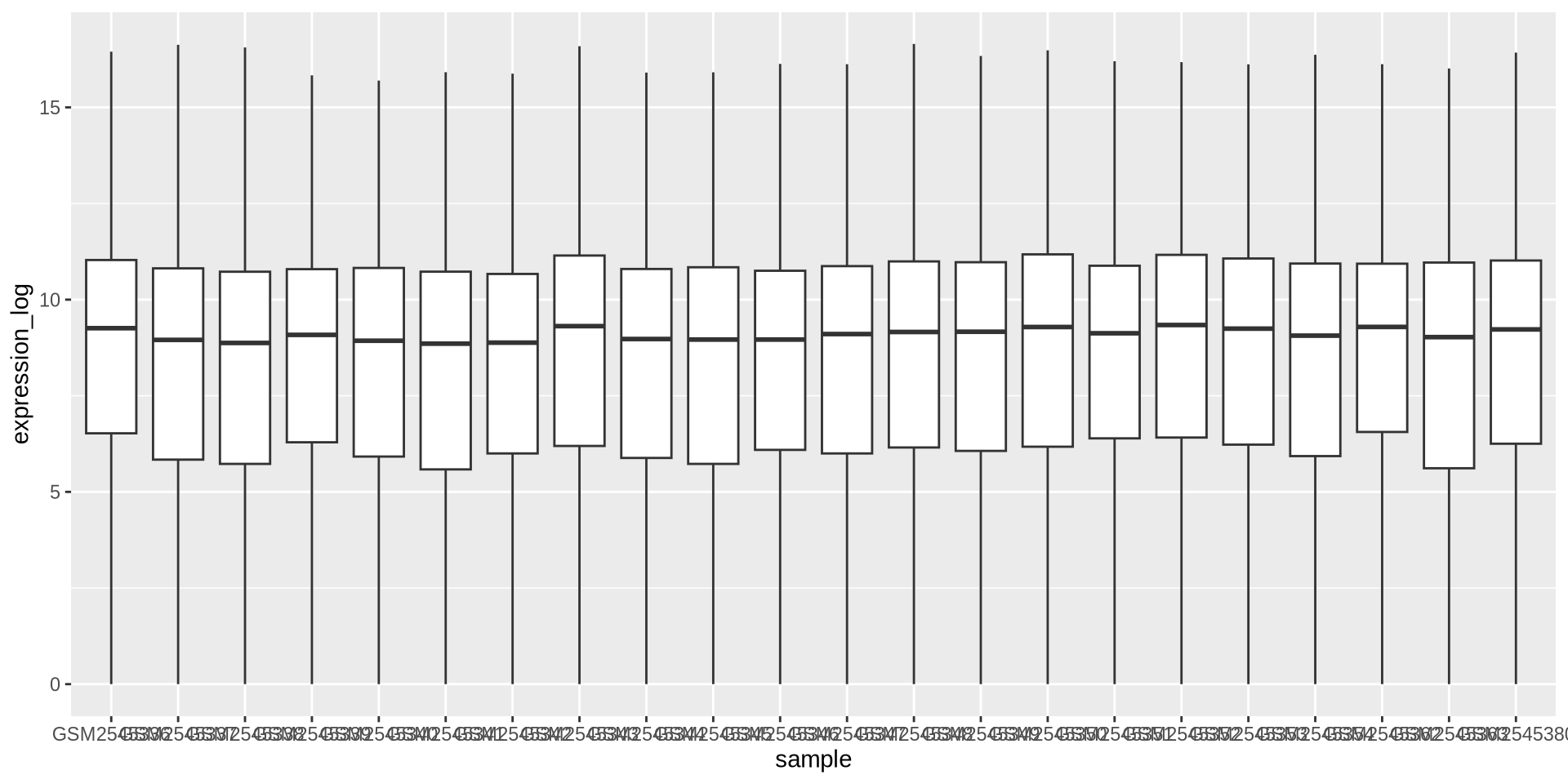
ggplot2 in action - geom_boxplot()
Boxplots are good to visualize distributions, let’s see gene log2-expression over samples
ggplot(rna_long, aes(y = expression_log, x = sample)) +
  geom_boxplot()
![]()
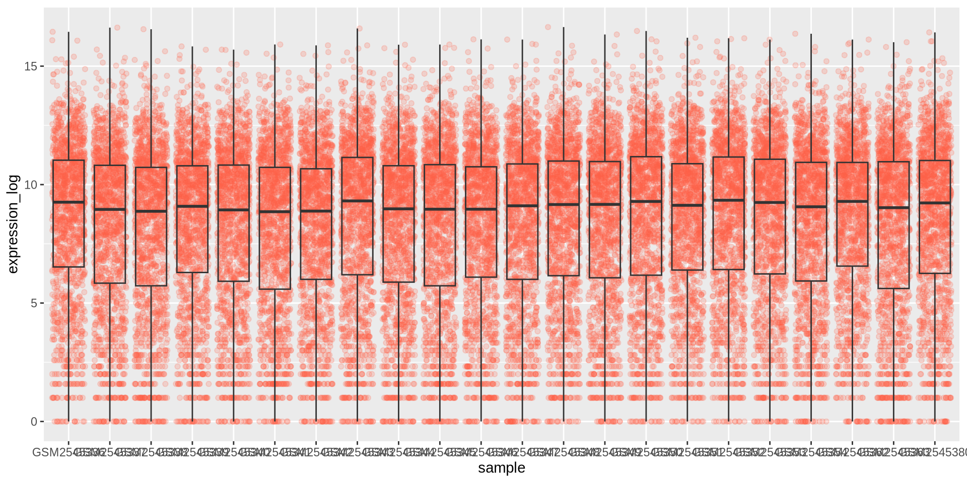
ggplot2 in action - geom_boxplot()
We can add the points over the boxplot with geom_jitter()
ggplot(rna_long, aes(y = expression_log, x = sample)) +
  geom_jitter(alpha = 0.2, color = "tomato") +
  geom_boxplot(alpha = 0)
![]()
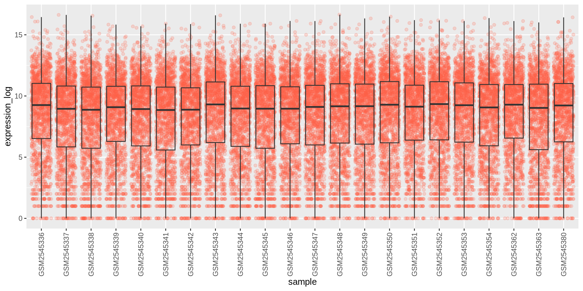
ggplot2 in action - geom_boxplot()
I can’t read the labels!! theme can modify the axis labels
ggplot(rna_long, aes(y = expression_log, x = sample)) +
  geom_jitter(alpha = 0.2, color = "tomato") +
  geom_boxplot(alpha = 0) +
  theme(axis.text.x = element_text(angle = 90,  hjust = 0.5, vjust = 0.5))
![]()
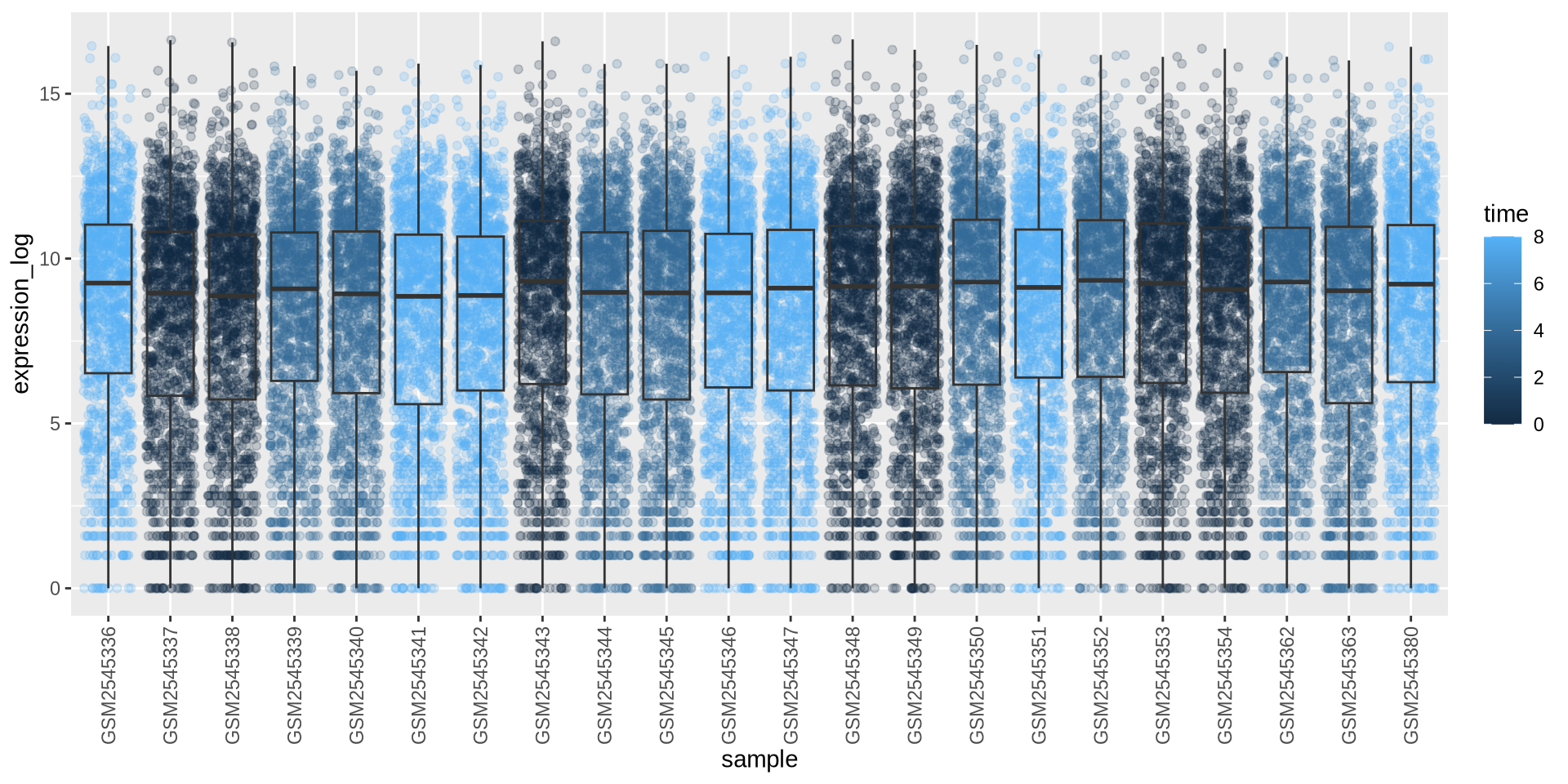
ggplot2 in action - geom_boxplot()
Can we color each sample per time point? Sure …
# time as integer
ggplot(rna_long, aes(y = expression_log, x = sample)) +
  geom_jitter(alpha = 0.2, aes(color = time)) +
  geom_boxplot(alpha = 0) +
  theme(axis.text.x = element_text(angle = 90,  hjust = 0.5, vjust = 0.5))
![]()
Is this what we want?
ggplot2 in action - geom_boxplot()
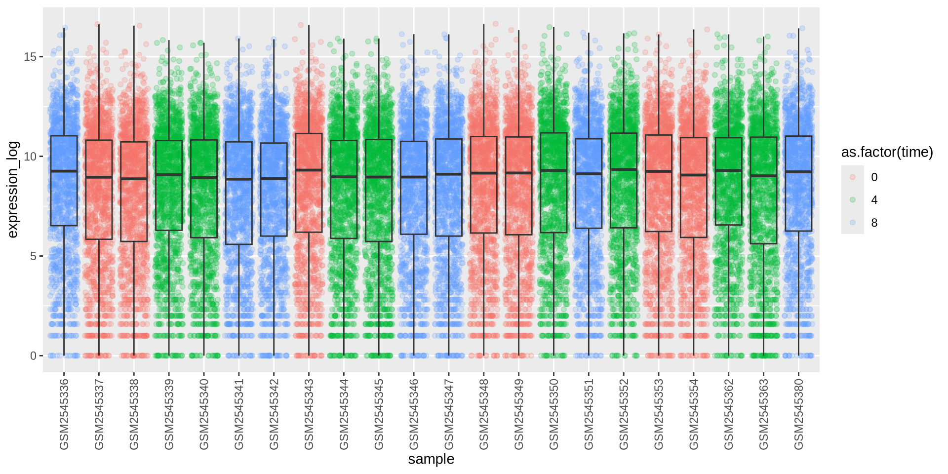
Can we color each sample per time point? Sure …
# time as factor
ggplot(rna_long, aes(y = expression_log, x = sample)) +
  geom_jitter(alpha = 0.2, aes(color = as.factor(time))) +
  geom_boxplot(alpha = 0) +
  theme(axis.text.x = element_text(angle = 90,  hjust = 0.5, vjust = 0.5))
![]()
Better …
ggplot2 in action - facet_wrap()
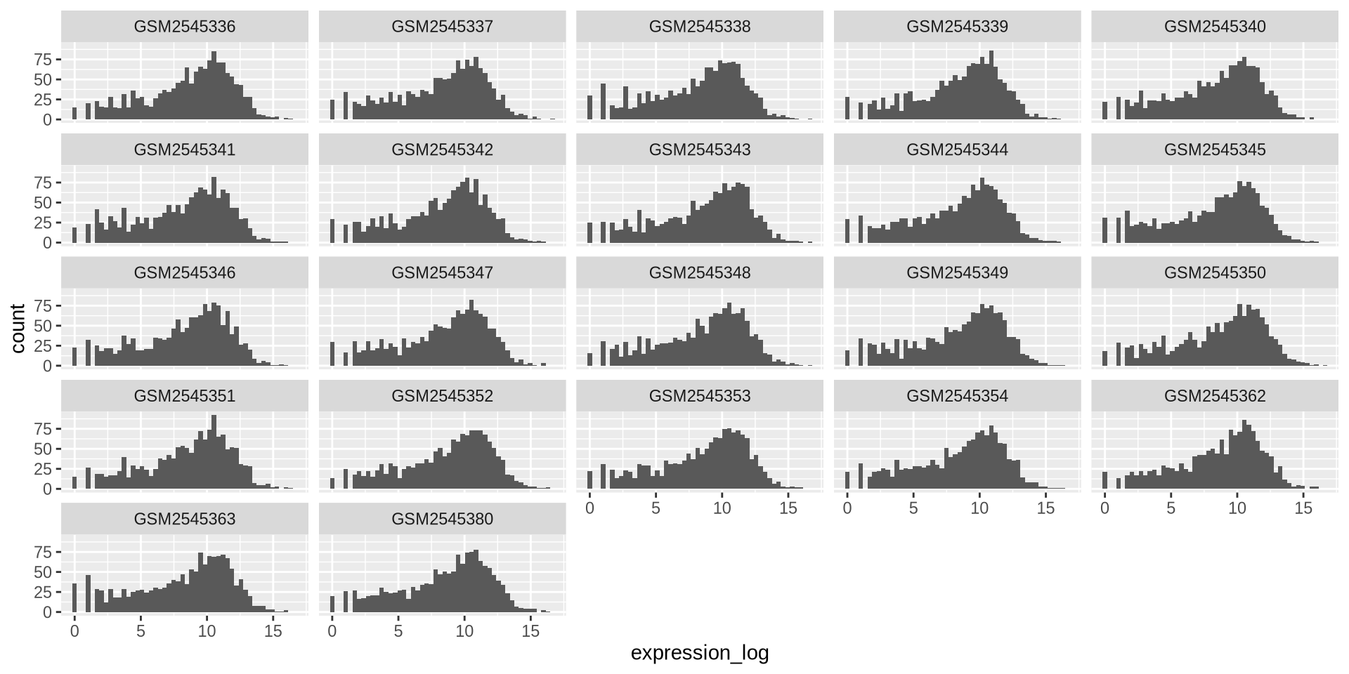
We can plot multiple elements in a single plot separately with facet_wrap()
ggplot(rna_long,aes(x = expression_log)) +
  geom_histogram(bins = 50) +
  facet_wrap(~ sample)
![]()
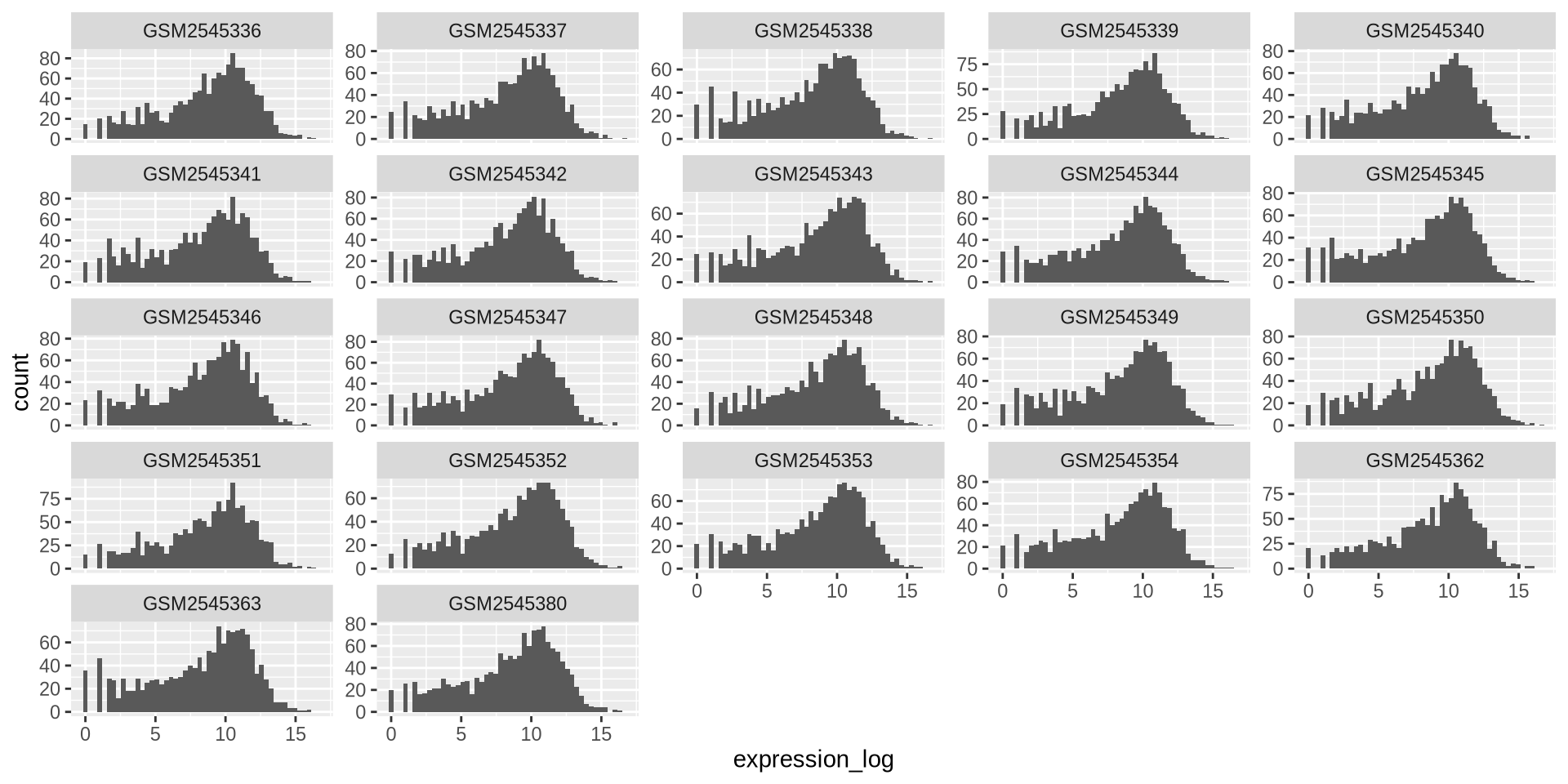
ggplot2 in action - facet_wrap()
By default, all scales are the same, to avoid this:
ggplot(rna_long, aes(x = expression_log)) +
  geom_histogram(bins = 50) +
  facet_wrap(~ sample, scales = "free_y")
![]()
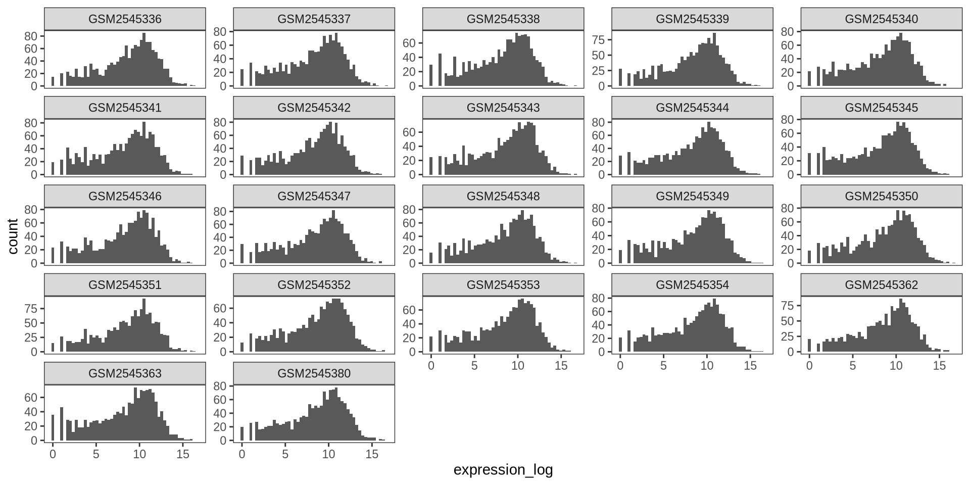
ggplot2 in action - theme_bw()
ggplot2 supports themes such as theme_bw()
ggplot(rna_long, aes(x = expression_log)) +
  geom_histogram(bins = 50) +
  facet_wrap(~ sample, scales = "free_y") +
  theme_bw() +
  theme(panel.grid = element_blank())
![]()
ggplot2 in action - ggsave()
At the end, we would like to save our gorgeous plot, we can use ggsave().
my_plot = ggplot(rna_long, aes(x = expression_log)) +
          geom_histogram(bins = 50) +
          facet_wrap(~ sample, scales = "free_y") +
          theme_bw() +
          theme(panel.grid = element_blank())

ggsave("samples_expr_histograms.png",
        my_plot,
        width = 15,
        height = 10)
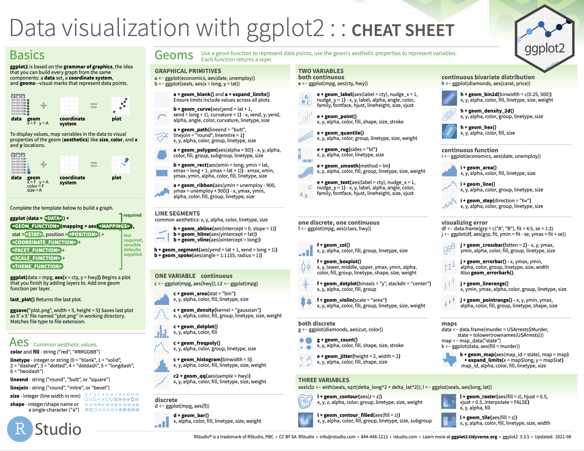
Tip of the iceberg
See this handy cheatsheet for lots more!
![]()
Any questions?
![]()