First Steps into a Regular Analysis
Setup
Note for Workbench users
If you have chosen to use the common library sitting at
/scratch/local/rseurat/pkg-lib-4.2.3, and the following
code block fails (after uncommenting the first line). Try this: restart
R (Ctrl+Shift+F10), and then execute in the Console
directly (no code block this time):
.libPaths(new=“/scratch/local/rseurat/pkg-lib-4.2.3”)
This (incl. restart) may be run up to two times, we did had the
unexpected experience were this was the case… 🤷
#.libPaths(new = "/scratch/local/rseurat/pkg-lib-4.2.3")

suppressMessages({
  library(tidyverse)
  library(Seurat)
})


set.seed(8211673)

knitr::opts_chunk$set(echo = TRUE, format = TRUE, out.width = "100%")


options(
  parallelly.fork.enable = FALSE,
  future.globals.maxSize = 8 * 1024^2 * 1000
)

plan("multicore", workers = 8) # function made available by SeuratObj automatically.## work directory: /home/runner/work/Rseurat/Rseurat/rmd## library path(s): /home/runner/micromamba/envs/Rseurat/lib/R/libraryLoad Data
We will be analyzing a dataset of Peripheral Blood Mononuclear Cells (PBMC) freely available from 10X Genomics. There are 2700 single cells that were sequenced with Illumina and aligned to the human transcriptome.
For further details on the primary analysis pipeline that gives you the count data, please head over to cellranger website.
The raw data can be found here, and you have already downloaded it with the repository Zip file. This dataset consists of 3 files:
genes.tsv: a list of ENSEMBL-IDs and their corresponding gene symbolbarcodes.tsv: a list of molecular barcodes that identifies each cell uniquelymatrix.mtx: count matrix once loaded together with the next files, this will be easily represented as a table with the number of molecules for each gene (rows) that are detected in each cell (columns)
This data resides in a directory
datasets/filtered_gene_bc_matrices/hg19 (relative to this
current markdown file). Let’s see the first lines of each file.
data_dir <- "./datasets/filtered_gene_bc_matrices/hg19/"
read.delim2(file.path(data_dir, "genes.tsv"), header = FALSE) %>% head()We can read this with a single command:
This data is extremely big and sparse, this variable is now an object
of type dgCMatrix. Lets examine a few genes in the first
thirty cells:
## 3 x 30 sparse Matrix of class "dgCMatrix"## [[ suppressing 30 column names 'AAACATACAACCAC-1', 'AAACATTGAGCTAC-1', 'AAACATTGATCAGC-1' ... ]]##
## CD3D 4 . 10 . . 1 2 3 1 . . 2 7 1 . . 1 3 . 2 3 . . . . . 3 4 1 5
## TCL1A . . . . . . . . 1 . . . . . . . . . . . . 1 . . . . . . . .
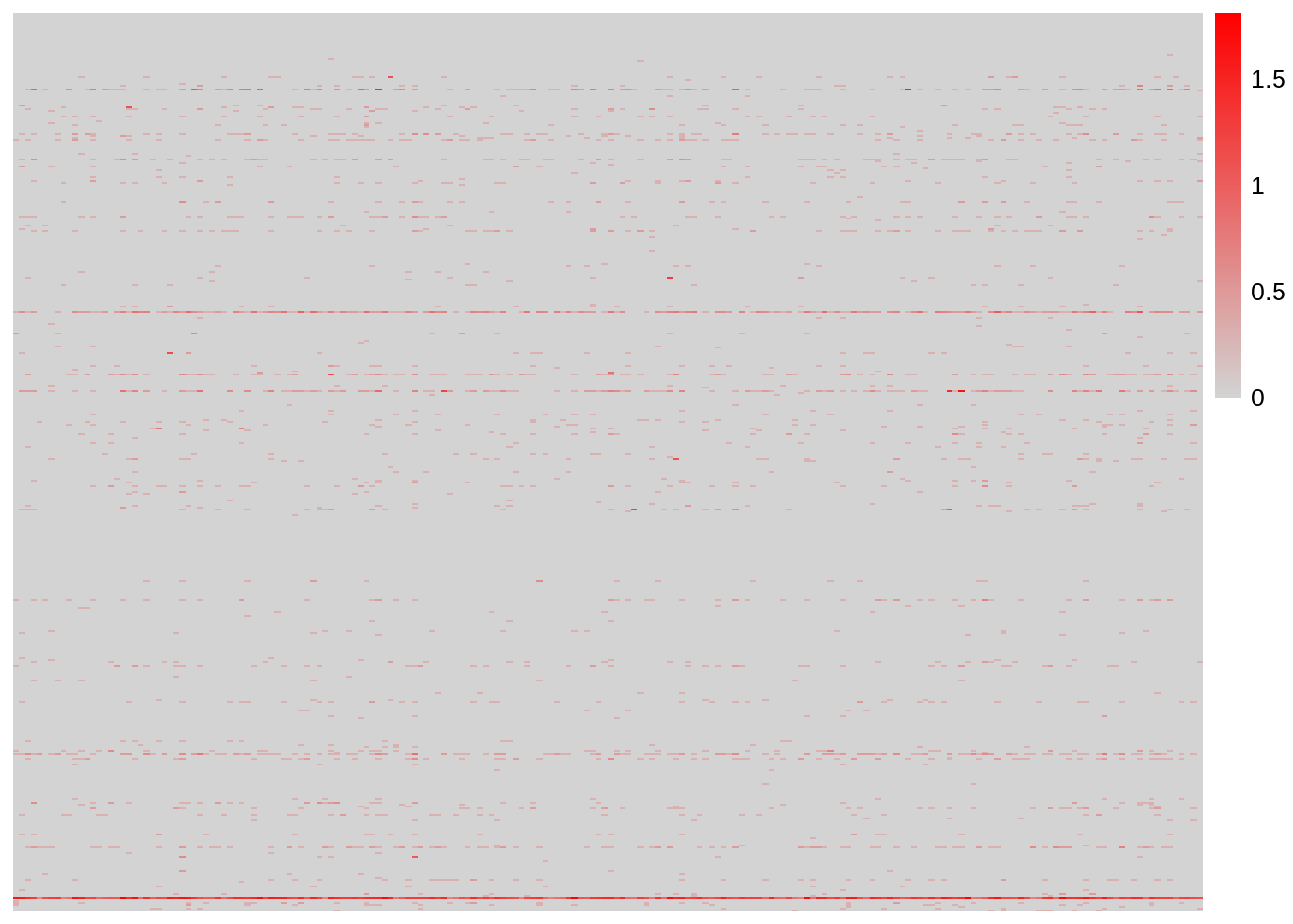
## MS4A1 . 6 . . . . . . 1 1 1 . . . . . . . . . 36 1 2 . . 2 . . . .And, we can have a heatmap of the first few genes and cells:
Seurat Object
Initialize the Seurat object with the raw (non-normalized data):
(
  pbmc <-
    CreateSeuratObject(
      counts = pbmc.data,
      project = "pbmc3k",
      min.cells = 3,
      min.features = 200
    ) %>% suppressWarnings()
) # extra outer pair of parenthesis mean 'print()'
## An object of class Seurat
## 13714 features across 2700 samples within 1 assay
## Active assay: RNA (13714 features, 0 variable features)
## 1 layer present: countsNote: Features refer to genes and are stored in rows of the matrix. Cells are stored in columns of the matrix.
The min.cells and min.features arguments
are first low-stringency filters. We are only loading
cells with at least 200 genes detected, and we are only including those
genes (features) that were detected in at least 3 cells.
With these filters in this particular dataset, we are reducing the
number of genes from 33000 to 14000.
The SeuratObject serves as a container that contains
both data (like the count matrix) and analysis (like PCA, or clustering
results) for a single-cell dataset.
On RStudio, you can use View(pbmc) to inspect all the
layers (slots).
At the top level, SeuratObject serves as a collection of
Assay and DimReduc layers, representing
expression data and dimensional reductions of the expression data,
respectively. The Assay slots are designed to hold
expression data of a single type, such as RNA-seq gene expression,
CITE-seq ADTs, cell hashtags, or imputed gene values.
On the other hand, DimReduc objects represent
transformations of the data contained within the Assay slots via various
dimensional reduction techniques such as PCA. For class-specific
details, including more in depth description of the layers (slots),
please see the documentation sections for each class:
Cell identities
For each cell, Seurat stores an identity label that gets updated throughout the processing steps. At any point, user may set cell identities as desired. Identities are mainly used in plotting functions, or in differential gene expression analysis. It is good practice to keep track of active (current) identities.
## AAACATACAACCAC-1 AAACATTGAGCTAC-1 AAACATTGATCAGC-1 AAACCGTGCTTCCG-1
##           pbmc3k           pbmc3k           pbmc3k           pbmc3k
## AAACCGTGTATGCG-1 AAACGCACTGGTAC-1
##           pbmc3k           pbmc3k
## Levels: pbmc3k##
## pbmc3k
## 2700On a freshly initiated seurat object, identity names are derived from
the project name and all cells have the same identity. If several seurat
objects are merged, the original object name can be stored as identity.
These original identities are stored in
pbmc@meta.data$orig.ident slot.
To set cell identities to a custom string:
##
## mysupercells
##         2700
In the same way, user may map identity labels to an existing meta data column.
Quality Control
One of our first goals is to identify (and filter) dead cells that could be the results of a harsh experimental protocol. A few QC metrics commonly used, include:
- The number of unique genes detected in each cell.
- Low-quality cells or empty droplets will often have very few genes.
- Cell doublets or multiplets may exhibit an aberrant high gene count.
- Similarly, the total number of molecules detected within a cell (correlates strongly with unique genes)
- The percentage of reads that map to the mitochondrial genome.
- Low-quality / dying cells often exhibit extensive mitochondrial contamination.
- We use the set of all genes starting with MT- as a set of mitochondrial genes.
For further details, see this publication.
The number of unique genes and total molecules are automatically
calculated during CreateSeuratObject(). You can find them
stored in the object meta.data, let’s see for the first 5
cells:
The @ operator we just used, is for accessing the layer
(slot) on the object.
The [[ operator can add columns to object metadata. This
is a great place to stash additional QC stats:
PercentageFeatureSet() function calculates the
percentage of counts originating from a set of features. In the example
above we can easily access all miochondrial genes because their names
start with “^MT”. So we give this as pattern (aka regular
expression).
Let’s visualize the distribution of these metrics over all cells (as Violin plots):
VlnPlot(
  pbmc,
  features = c("nFeature_RNA", "nCount_RNA", "percent.mt"),
  ncol = 3,
  layer = "counts"
)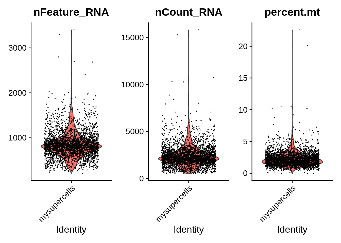
The VlnPlot() function plots the probability density
function for all the specified variables (features).
Individually these variables may not fully discriminate dead cells,
but could also reflect real biological properties (e.g. higher
mitochondrial count). Therefore it is useful to look a relationship
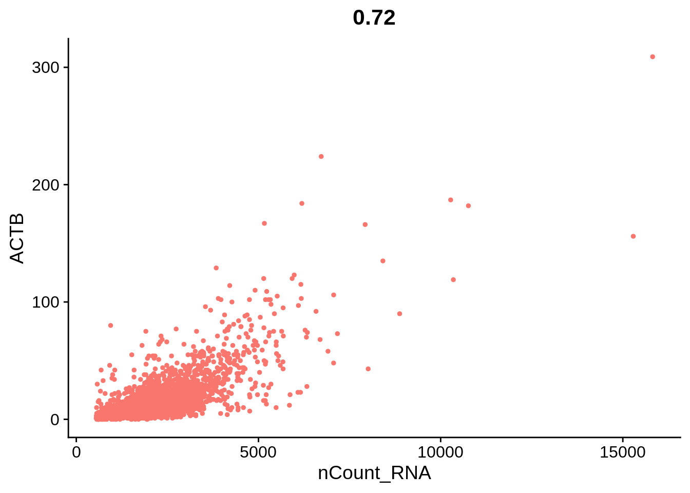
between these variables. FeatureScatter() is typically used
to visualize relationships between features, but it can also be used for
anything calculated at the object, i.e. columns in object metadata or
for genes (rows in the count matrix). All those are
features
plot1 <- FeatureScatter(pbmc, feature1 = "nCount_RNA", feature2 = "percent.mt") + NoLegend()
plot2 <- FeatureScatter(pbmc, feature1 = "nCount_RNA", feature2 = "nFeature_RNA") + NoLegend()
plot3 <- FeatureScatter(pbmc, feature1 = "nCount_RNA", feature2 = "ACTB", slot  = "counts") + NoLegend()
plot1 + plot2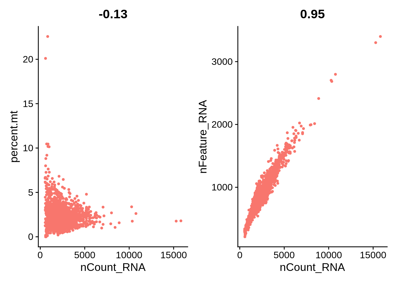
Filtering and Transformation
Select Cells
Based on cell-specific features we can subset our
SeuratObject to keep only the ‘cells’ in good state. In
this case, based on the previous Violin plots, we’ll use the following
criteria:
- Unique feature counts over 2500 or below 200.
- \(>5%\) mitochondrial counts.
Normalization
After removing unwanted cells from the dataset, the next step is to
normalize the data. By default, we employ a global-scaling normalization
method “LogNormalize” that normalizes the feature expression
measurements for each cell by the total expression, multiplies this by a
scale factor (10000 by default), and log-transforms the result.
Normalized values are stored in
pbmc[["RNA"]]@layers$data.
## Normalizing layer: countsInformative Genes
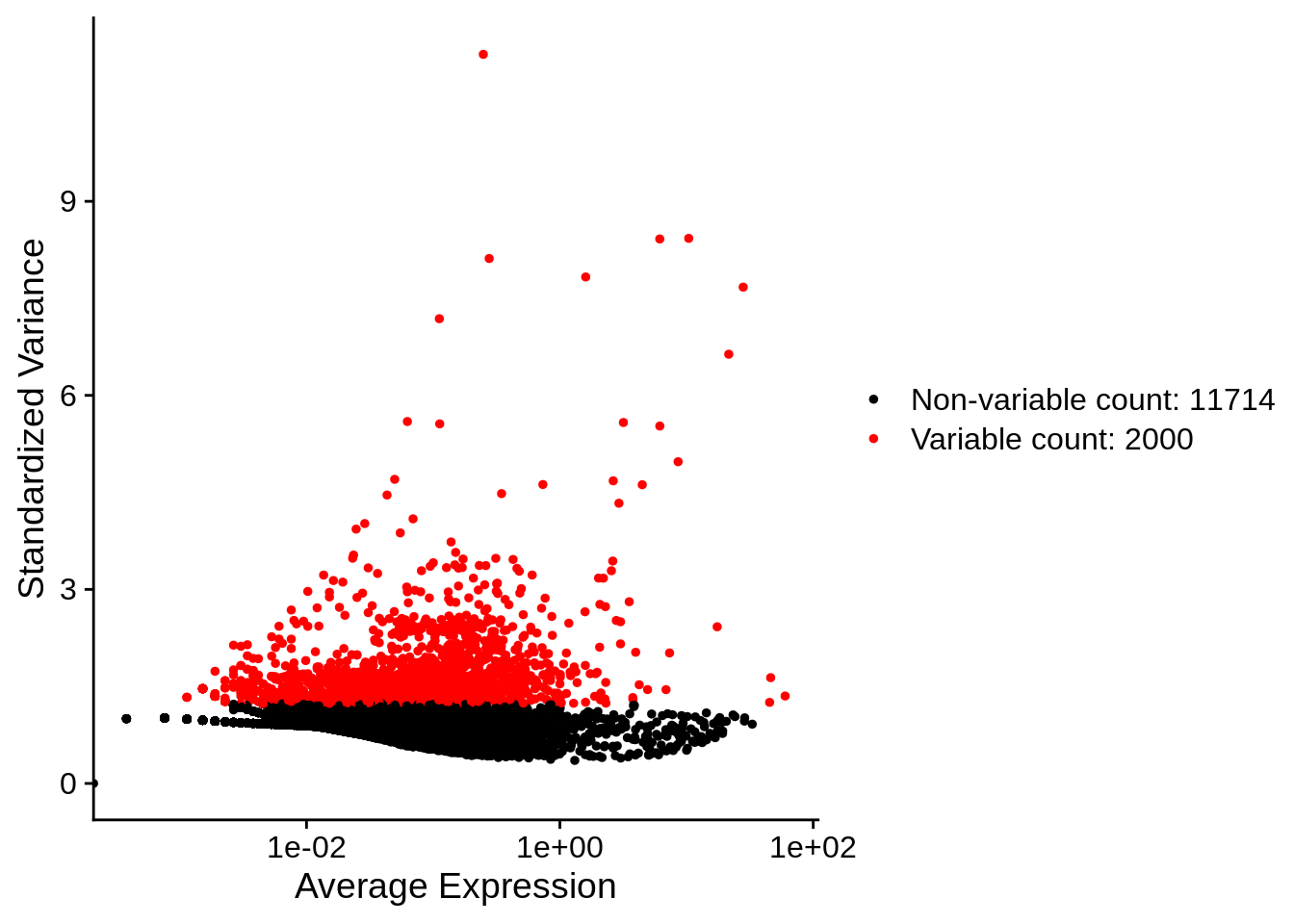
The main goal is to select genes that will help us to organize cells according to the transcription profile, this are the genes that will be in the spotlight for our following step. Therefore we look for a subset of genes (“features”) that exhibit high cell-to-cell variation in the dataset (i.e, they are highly expressed in some cells, and lowly expressed in others).
To identify the most highly variable genes, Seurat models the
mean-variance relationship inherent in the data using the
FindVariableFeatures() function. By default, it uses the
vst methodology with 2000 features per dataset.
First, fits a line to the relationship of log(variance)
and log(mean) using local polynomial regression
(loess). Then standardizes the feature values using the
observed mean and expected variance (given by the fitted line). Feature
variance is then calculated on the standardized values after clipping to
a maximum (by default, square root of the number of cells). These will
be used downstream in dimensional reductions like PCA.
## Finding variable features for layer countsPlot variable features:
Now with labels, taking top10 genes as in the recent question:
## When using repel, set xnudge and ynudge to 0 for optimal results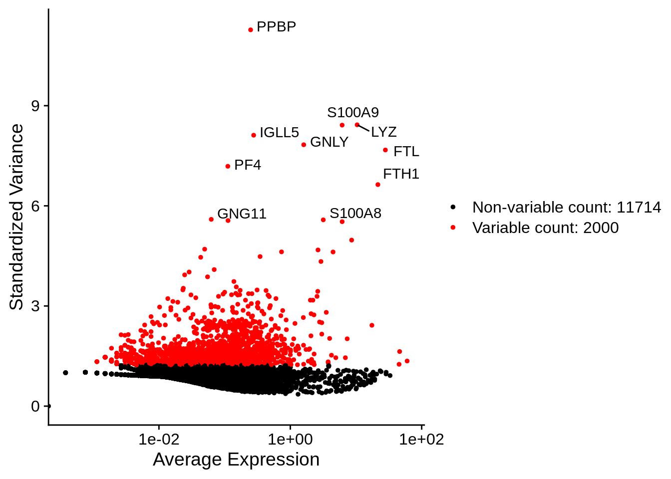
Scaling
Next, we apply a linear transformation (‘scaling’) that is a standard
pre-processing step prior to dimensional reduction techniques like PCA.
The ScaleData() function:
- Shifts the expression of each gene, so that the mean expression
across cells is
0 - Scales the expression of each gene, so that the variance across
cells is
1. This step gives equal weight in downstream analyses, so that highly-expressed genes do not dominate. - more generally one can also model the mean expression as a function
of other variables from the metadata, i.e. regress them out
before scaling the residuals (see:
vars.to.regress) - The results of this are stored in
pbmc[["RNA"]]@layers$scale.data
## Centering and scaling data matrixDimensional Reduction
Next we perform PCA on the scaled data. By default, only the previously determined variable features are used as input, but can be defined using features argument if you wish to choose a different subset.
## PC_ 1
## Positive:  CST3, TYROBP, LST1, AIF1, FTL, FTH1, LYZ, FCN1, S100A9, TYMP
##     FCER1G, CFD, LGALS1, S100A8, CTSS, LGALS2, SERPINA1, IFITM3, SPI1, CFP
##     PSAP, IFI30, SAT1, COTL1, S100A11, NPC2, GRN, LGALS3, GSTP1, PYCARD
## Negative:  MALAT1, LTB, IL32, IL7R, CD2, B2M, ACAP1, CD27, STK17A, CTSW
##     CD247, GIMAP5, AQP3, CCL5, SELL, TRAF3IP3, GZMA, MAL, CST7, ITM2A
##     MYC, GIMAP7, HOPX, BEX2, LDLRAP1, GZMK, ETS1, ZAP70, TNFAIP8, RIC3
## PC_ 2
## Positive:  CD79A, MS4A1, TCL1A, HLA-DQA1, HLA-DQB1, HLA-DRA, LINC00926, CD79B, HLA-DRB1, CD74
##     HLA-DMA, HLA-DPB1, HLA-DQA2, CD37, HLA-DRB5, HLA-DMB, HLA-DPA1, FCRLA, HVCN1, LTB
##     BLNK, P2RX5, IGLL5, IRF8, SWAP70, ARHGAP24, FCGR2B, SMIM14, PPP1R14A, C16orf74
## Negative:  NKG7, PRF1, CST7, GZMB, GZMA, FGFBP2, CTSW, GNLY, B2M, SPON2
##     CCL4, GZMH, FCGR3A, CCL5, CD247, XCL2, CLIC3, AKR1C3, SRGN, HOPX
##     TTC38, APMAP, CTSC, S100A4, IGFBP7, ANXA1, ID2, IL32, XCL1, RHOC
## PC_ 3
## Positive:  HLA-DQA1, CD79A, CD79B, HLA-DQB1, HLA-DPB1, HLA-DPA1, CD74, MS4A1, HLA-DRB1, HLA-DRA
##     HLA-DRB5, HLA-DQA2, TCL1A, LINC00926, HLA-DMB, HLA-DMA, CD37, HVCN1, FCRLA, IRF8
##     PLAC8, BLNK, MALAT1, SMIM14, PLD4, P2RX5, IGLL5, LAT2, SWAP70, FCGR2B
## Negative:  PPBP, PF4, SDPR, SPARC, GNG11, NRGN, GP9, RGS18, TUBB1, CLU
##     HIST1H2AC, AP001189.4, ITGA2B, CD9, TMEM40, PTCRA, CA2, ACRBP, MMD, TREML1
##     NGFRAP1, F13A1, SEPT5, RUFY1, TSC22D1, MPP1, CMTM5, RP11-367G6.3, MYL9, GP1BA
## PC_ 4
## Positive:  HLA-DQA1, CD79B, CD79A, MS4A1, HLA-DQB1, CD74, HIST1H2AC, HLA-DPB1, PF4, SDPR
##     TCL1A, HLA-DRB1, HLA-DPA1, HLA-DQA2, PPBP, HLA-DRA, LINC00926, GNG11, SPARC, HLA-DRB5
##     GP9, AP001189.4, CA2, PTCRA, CD9, NRGN, RGS18, CLU, TUBB1, GZMB
## Negative:  VIM, IL7R, S100A6, IL32, S100A8, S100A4, GIMAP7, S100A10, S100A9, MAL
##     AQP3, CD2, CD14, FYB, LGALS2, GIMAP4, ANXA1, CD27, FCN1, RBP7
##     LYZ, S100A11, GIMAP5, MS4A6A, S100A12, FOLR3, TRABD2A, AIF1, IL8, IFI6
## PC_ 5
## Positive:  GZMB, NKG7, S100A8, FGFBP2, GNLY, CCL4, CST7, PRF1, GZMA, SPON2
##     GZMH, S100A9, LGALS2, CCL3, CTSW, XCL2, CD14, CLIC3, S100A12, RBP7
##     CCL5, MS4A6A, GSTP1, FOLR3, IGFBP7, TYROBP, TTC38, AKR1C3, XCL1, HOPX
## Negative:  LTB, IL7R, CKB, VIM, MS4A7, AQP3, CYTIP, RP11-290F20.3, SIGLEC10, HMOX1
##     LILRB2, PTGES3, MAL, CD27, HN1, CD2, GDI2, CORO1B, ANXA5, TUBA1B
##     FAM110A, ATP1A1, TRADD, PPA1, CCDC109B, ABRACL, CTD-2006K23.1, WARS, VMO1, FYB
Do you feel like you need a refresher on PCA? check StatQuest with Josh Starmer video explaining PCA by SVD step by step! (duration: 20 minutes)
Examine and visualize PCA results a few different ways:
## PC_ 1
## Positive:  CST3, TYROBP, LST1, AIF1, FTL
## Negative:  MALAT1, LTB, IL32, IL7R, CD2
## PC_ 2
## Positive:  CD79A, MS4A1, TCL1A, HLA-DQA1, HLA-DQB1
## Negative:  NKG7, PRF1, CST7, GZMB, GZMA
## PC_ 3
## Positive:  HLA-DQA1, CD79A, CD79B, HLA-DQB1, HLA-DPB1
## Negative:  PPBP, PF4, SDPR, SPARC, GNG11
## PC_ 4
## Positive:  HLA-DQA1, CD79B, CD79A, MS4A1, HLA-DQB1
## Negative:  VIM, IL7R, S100A6, IL32, S100A8
## PC_ 5
## Positive:  GZMB, NKG7, S100A8, FGFBP2, GNLY
## Negative:  LTB, IL7R, CKB, VIM, MS4A7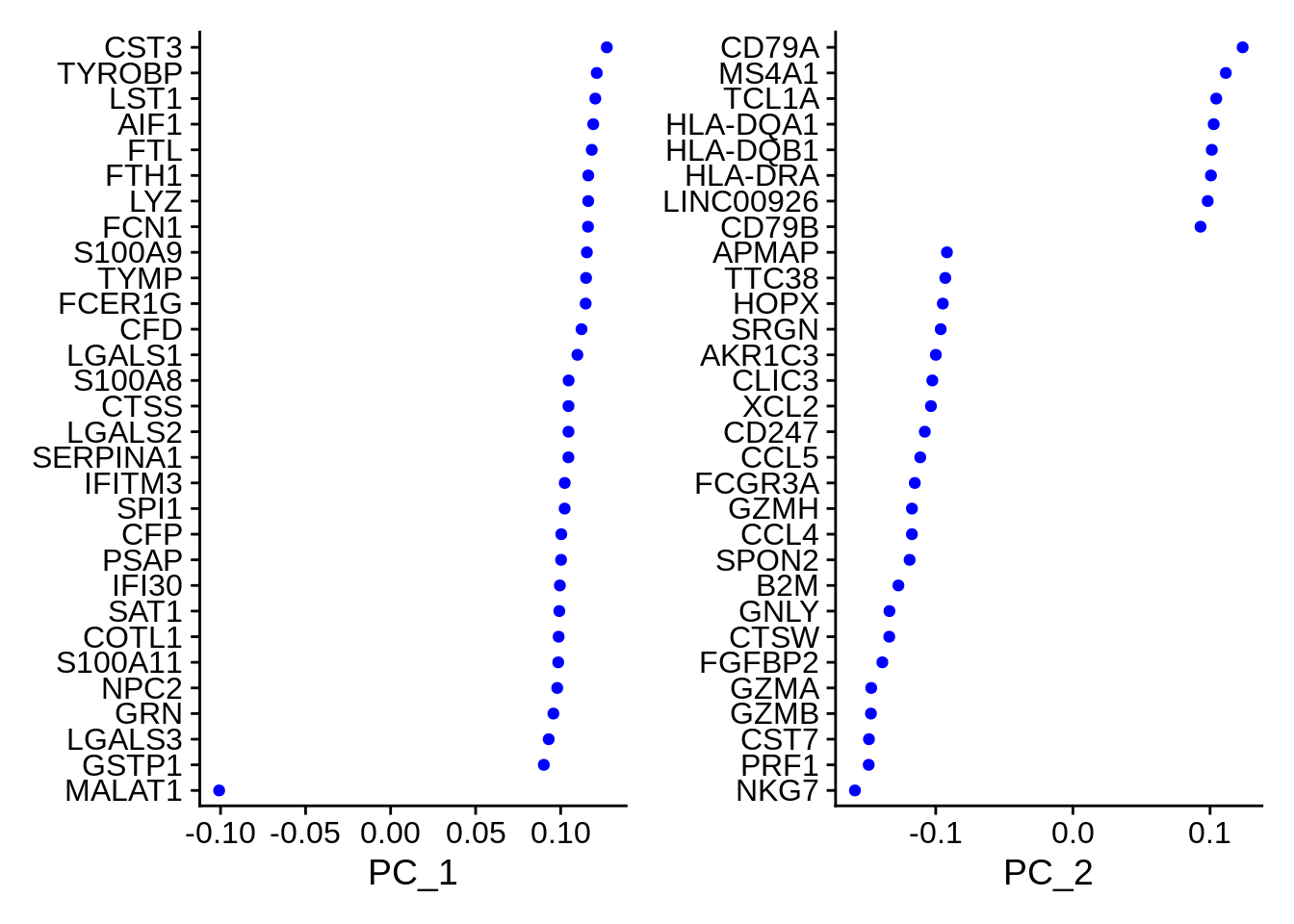
In particular DimHeatmap() allows for easy exploration
of the primary sources of heterogeneity in a dataset, and can be useful
when trying to decide which PCs to include for further downstream
analyses. Both cells and features are ordered according to their PCA
scores. Setting cells to a number plots the ‘extreme’ cells on both ends
of the spectrum, which dramatically speeds plotting for large datasets.
Though clearly a supervised analysis, we find this to be a valuable tool
for exploring correlated feature sets.
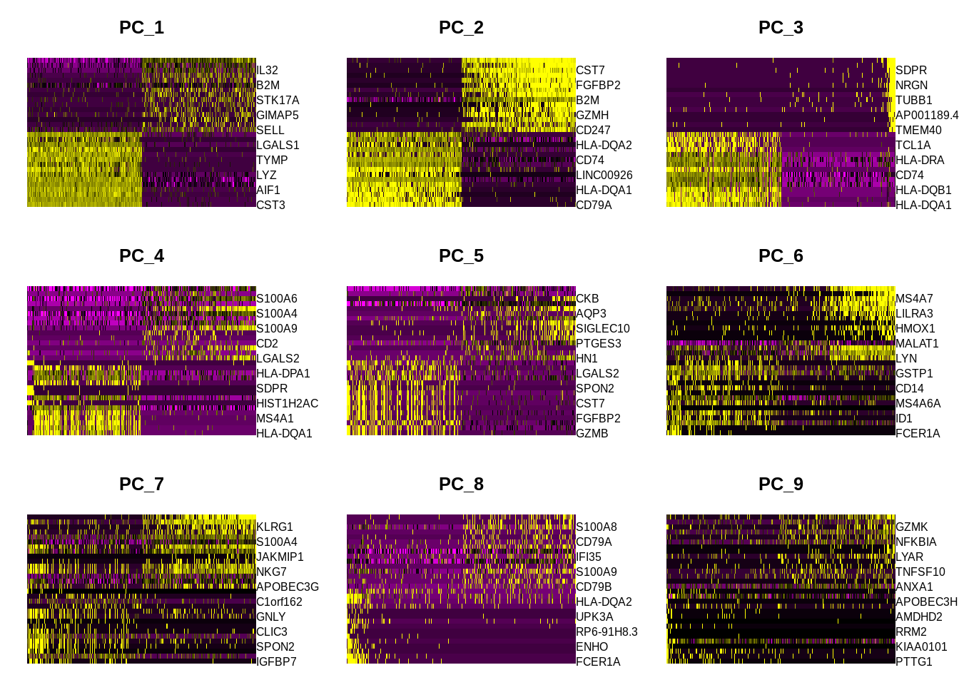
To overcome the extensive technical noise in any single gene for scRNA-seq data, Seurat clusters cells based on their PCA scores. Here each PC essentially represents a ‘metagene’ that combines information across a correlated gene sets. The top principal components therefore represent a robust compression of the dataset.
One quick way to determine the ‘dimensionality’ of the dataset is by eyeballing how the percentage of variance explained decreases:
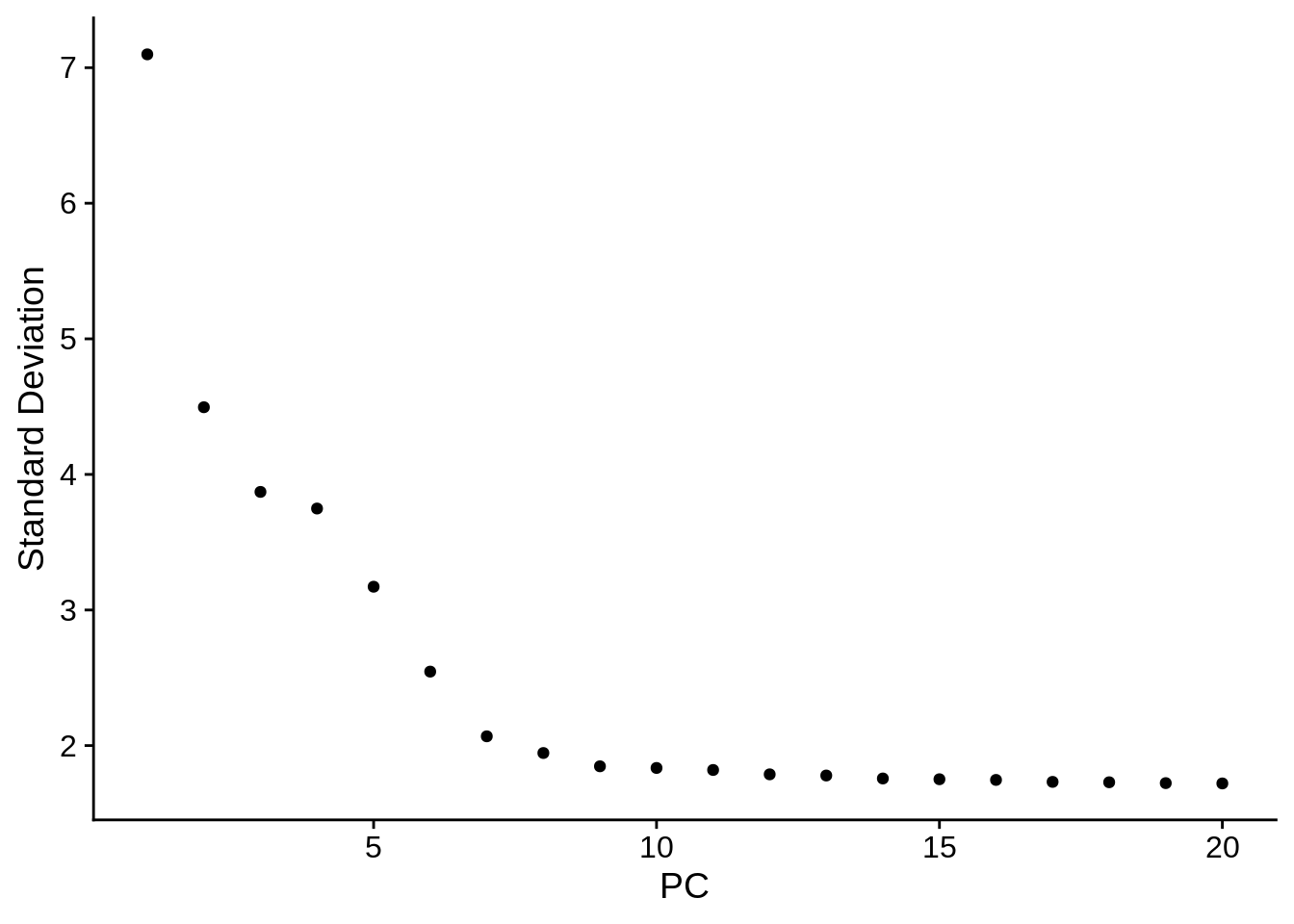
When picking the ‘elbow’ point, remember that it’s better to err on the higher side! Also, if your research questions aim towards rare celltypes, you may definitely include more PCs (think about it in terms of the variance in gene expression values).
Playing around with metadata
Let’s have a look again into the values we got in
percent.mt:
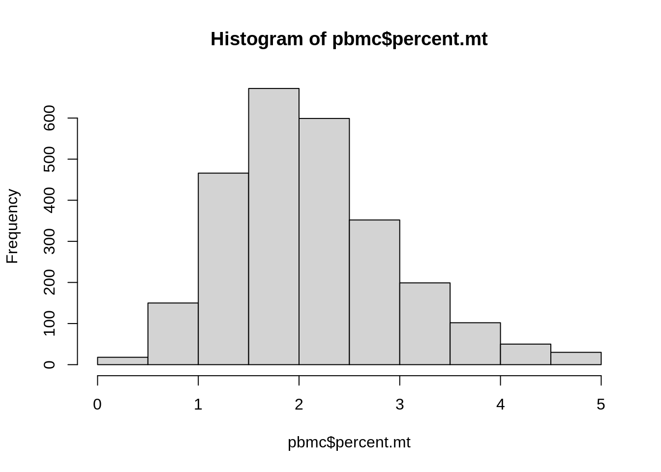
##    Min. 1st Qu.  Median    Mean 3rd Qu.    Max.
##   0.000   1.520   2.011   2.117   2.591   4.994
Now, let’s add a column annotating samples with low, medium or high
percent.mt
pbmc$mt.categories <- NA

pbmc$mt.categories[pbmc$percent.mt <= 1.520] <- "Low"
pbmc$mt.categories[pbmc$percent.mt > 1.520 &
                     pbmc$percent.mt <= 2.591 ] <- "Medium"
pbmc$mt.categories[pbmc$percent.mt > 2.591] <- "High"

stopifnot(all(! is.na(pbmc$percent.mt)))
Let’s explore what we just did:
VlnPlot(pbmc,
  features = "percent.mt",
  group.by = "mt.categories",
  sort = "decreasing"
) +
  ggtitle(NULL) + NoLegend()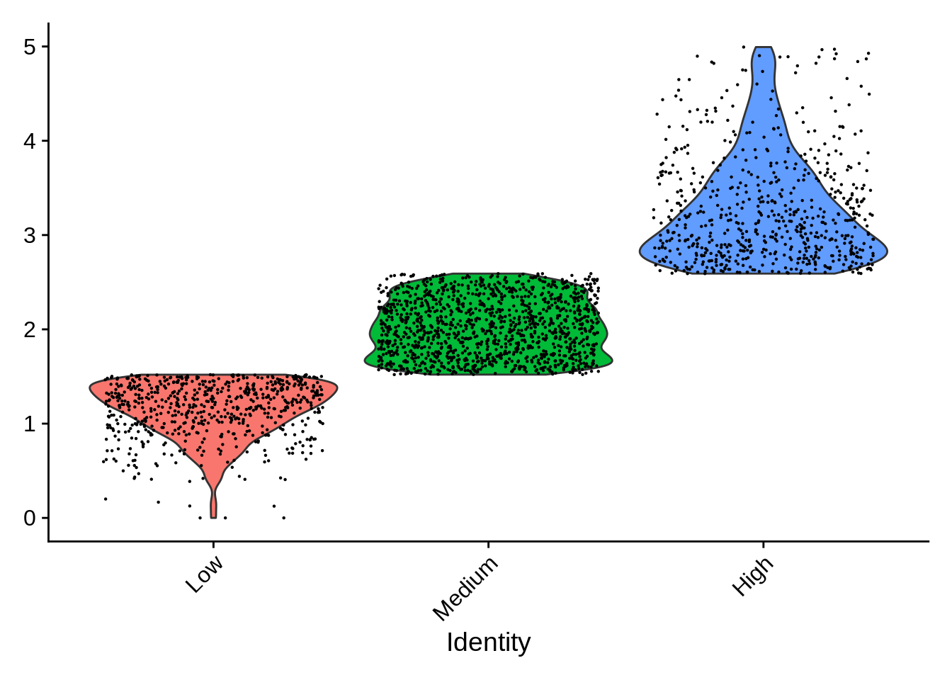
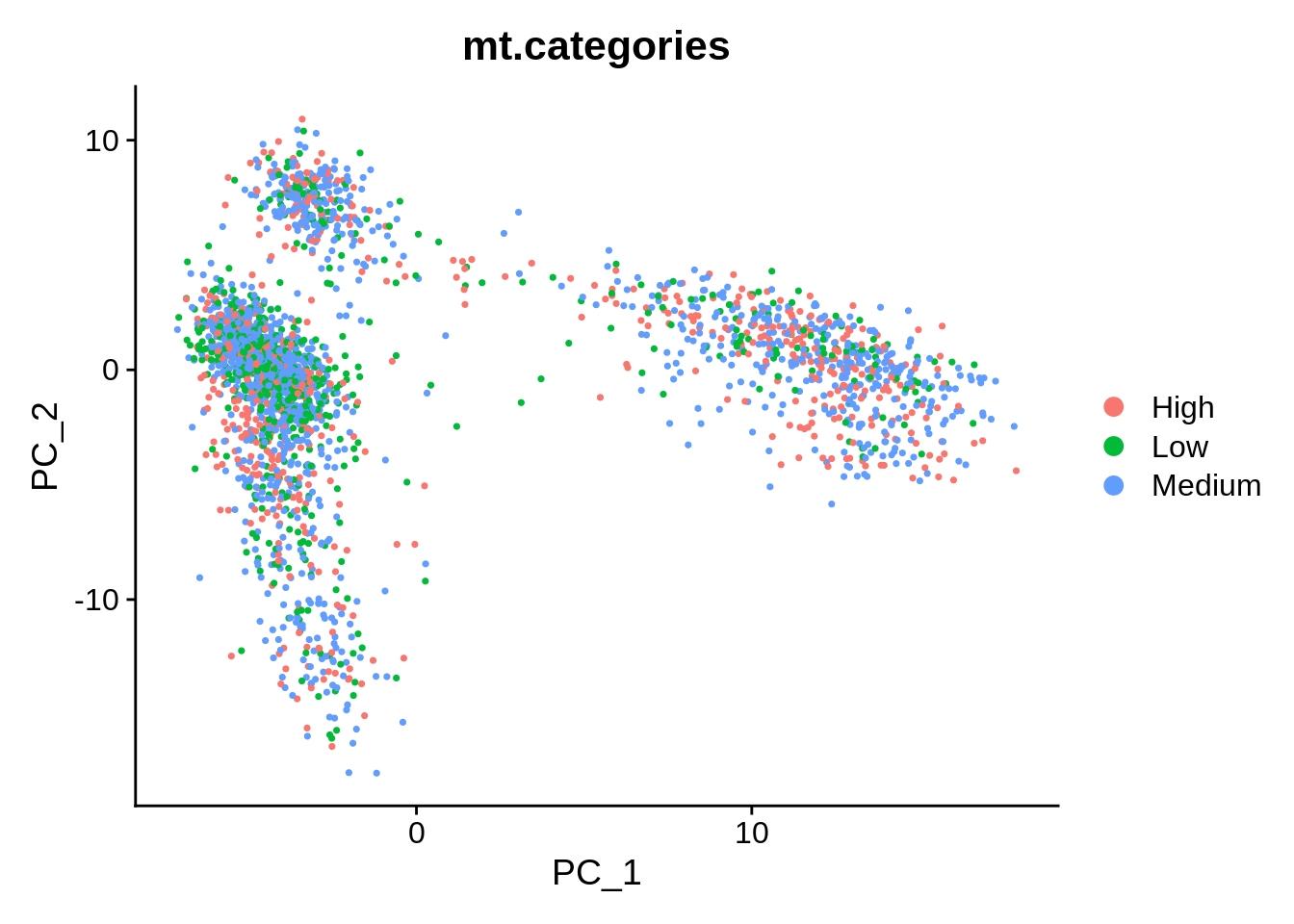
Finally, we are able to plot PCA, and have the cells coloured by these categories:
End
Optional excercise 1: annotate the cells in the dataset with percentage expression of the apoptotic signature, and colour cells by this value on a dimentional reduction plot. You can find the file with genes annotated with GO term GO0006915 “apoptotic process” in “datasets/GOterms/GO0006915.tsv” .
Optional excercise 2: correlate values of PC1 and/or PC2 and number of expressed genes or any other meta.data column of your choice. FeatureScatter() could be helpful.
Optional excercise 3: grab another example dataset from SeuratData and process it in a similar way. Some help: