Cluster Visualization
Setup
# .libPaths(new = "/scratch/local/rseurat/pkg-lib-4.2.3")

suppressMessages({
  library(tidyverse)
  library(Seurat)
})


set.seed(8211673)

knitr::opts_chunk$set(echo = TRUE, format = TRUE, out.width = "100%")


options(
  parallelly.fork.enable = FALSE,
  future.globals.maxSize = 8 * 1024^2 * 1000
)

plan("multicore", workers = 8)
## work directory: /home/runner/work/Rseurat/Rseurat/rmd## library path(s): /home/runner/micromamba/envs/Rseurat/lib/R/libraryLoad Data
We’ll be working with the data from “First steps”, let’s quickly re-load and re-process again:
pbmc <- Read10X(data.dir = "./datasets/filtered_gene_bc_matrices/hg19/") %>%
  CreateSeuratObject(counts = ., project = "pbmc3k", min.cells = 3, min.features = 200)

pbmc[["percent.mt"]] <- PercentageFeatureSet(pbmc, pattern = "^MT-")

pbmc <- subset(pbmc, subset = nFeature_RNA > 200 & nFeature_RNA < 2500 & percent.mt < 5)

pbmc <- NormalizeData(pbmc, verbose = FALSE)

pbmc <- FindVariableFeatures(pbmc, verbose = FALSE)

pbmc <- ScaleData(pbmc, features = rownames(pbmc), verbose = FALSE)

pbmc <- RunPCA(pbmc, features = VariableFeatures(pbmc), verbose = FALSE)
When working on your own, you will avoid re-running everything like
we did here. We had the privilege of working with an educational dataset
that has only 2700 cells. So these steps are not super intensive to
re-compute. On a real dataset, you would write it to disk with
saveRDS(SeuratObj, file = "./data.rds"). And afterwards,
you would load from disk with the function
readRDS.
It’s important that we keep track of our active identity.
Clustering
The next step follow the work pioneered by PhenoGraph, a
robust computational method that partitions high-dimensional single-cell
data into subpopulations. Building on these subpopulations,
PhenoGraph authors developed additional methods to extract
high-dimensional signaling phenotypes and infer differences in
functional potential between subpopulations.
These subpopulations could be of biological relevance, retrieving these is our goal. The definition of such groupings depend upon the parameters. This algorithm in particular is the K Nearest Neighbors (KNN) graph that is constructed based on the euclidean distance in PCA space. For an example of building such a graph, imagine we took only two PCs (principal components) and had such an arrangement of cells like these dots in a 2D plane…
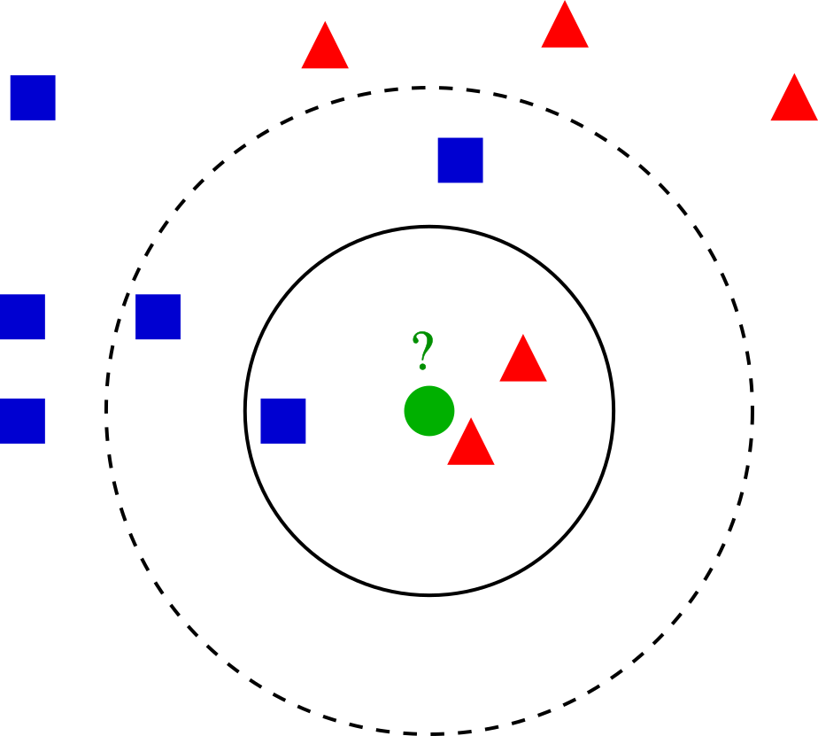
On our example of k-NN classification for a cell highlighted in green color, the test sample (green dot) should be classified either to the group made of blue squares or to the subpopulation of cells here represented in red triangles. If k = 3 (solid line circle) it is assigned to the red triangles because there are 2 triangles and only 1 square inside the inner circle. If k = 5 (dashed line circle) it is assigned to the blue squares (3 squares vs. 2 triangles inside the outer circle).
There’s a drawback with the ‘majority voting’ scheme, the assignment of such clusters is biased towards the clusters that have greater number of members (especially when ties start appearing). For that reason, we’ll refine the process by using a graph, where edge weights between any two cells is based on the shared overlap in their local neighborhoods (Jaccard similarity).
\[ J(A,B) = \frac{Intersect(A,B)}{Union(A,B)} = J(B,A) \]
If two datasets share the exact same members, their Jaccard Similarity Index will be 1. Conversely, if they have no members in common then their similarity will be 0.
All the process described before, including the use of Jaccard
Similarity Index is performed using the FindNeighbors()
function, and takes as input the previously defined dimensionality of
the dataset (first 10 PCs). So the KNN is build using multidimensional
space, but the rules we just saw for 2D still apply.
## Computing nearest neighbor graph## Computing SNNWe want to keep our clusters looking natural. That is, we want to have a modularity optimization on top of all. For that, we’ll use the community search algorithm for graphs called Louvain. You can read more about it and it’s improved version (“Leiden”) here.
The FindClusters() function implements this procedure,
and contains a resolution parameter that sets the
‘granularity’ of the downstream clustering, with increased values
leading to a greater number of clusters. Usually, setting this parameter
between 0.4 and 1.2 returns good results for
single-cell datasets of around 3K cells. You can easily try various
values and see how it performs. Optimal resolution often increases for
larger datasets.
## Modularity Optimizer version 1.3.0 by Ludo Waltman and Nees Jan van Eck
##
## Number of nodes: 2638
## Number of edges: 95927
##
## Running Louvain algorithm...
## Maximum modularity in 10 random starts: 0.8728
## Number of communities: 9
## Elapsed time: 0 seconds
After this process, we have a new seurat_clusters column
in our meta.data layer (slot). Also, this is our new active
identity!
## AAACATACAACCAC-1 AAACATTGAGCTAC-1 AAACATTGATCAGC-1 AAACCGTGCTTCCG-1
##                2                3                2                1
## AAACCGTGTATGCG-1 AAACGCACTGGTAC-1
##                6                2
## Levels: 0 1 2 3 4 5 6 7 8
Plot PC values per cluster
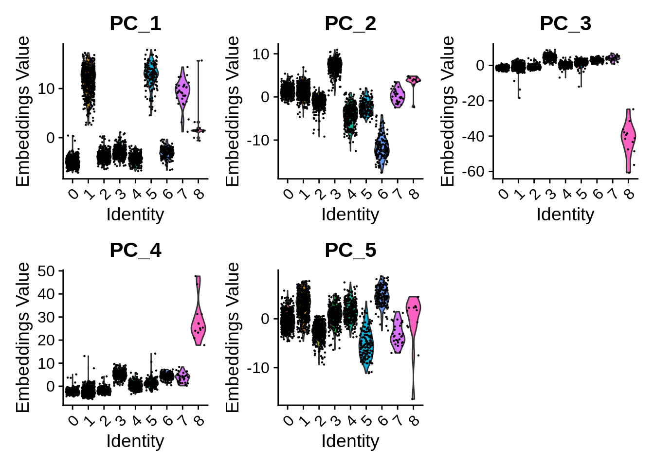
Per-cluster values can be plotted e.g. as violin plots with the Seurat function VlnPlot():
Embeddings in 2D space
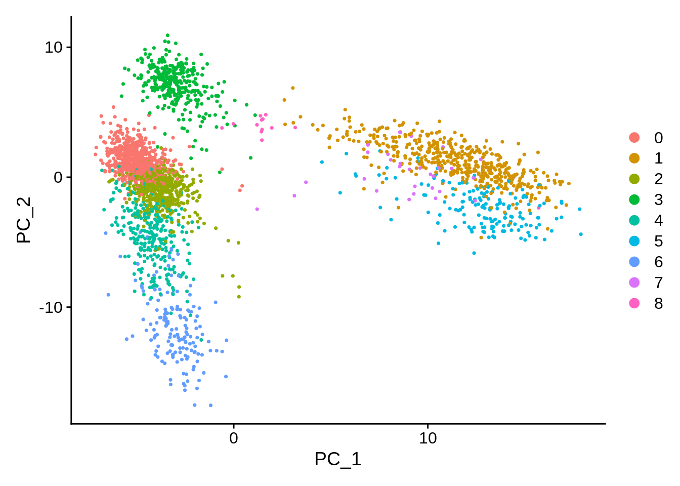
PCA: Principal Component Analysis
One key feature of PCA is that it amounts to a linear data transformation which preserves distances between all samples (here: cells) by simple rotation in a high dimensional space. This is useful to identify informative directions and reduce noise (before clustering). The projection on the first two components is often visualized because those correspond to the directions of maximal variation in the data. And as we might expect, the different clusters can be seen as –more or less– separating in this projection:
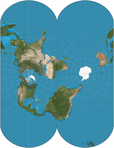
There are other non-linear projection techniques that aim specifically to preserve distances between samples in 2 dimensions. In general this is impossible, but one can at least hope to preserve local distances: nearby cells in high dimension will be nearby in 2D.
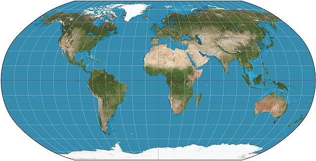
Consider a simple geographic map, it shares the same goal. Given its limits, it requires some choices: a sphere cannot be mapped uniquely into 2D. That is why we have different projections, depicted here are two different works, just as an example.
For single-cell studies, two (similar) methodologies are popular: t-SNE and UMAP. The second one was developed 10 years later, and it adds a bunch of advantages.
t-SNE: t-distributed stochastic neighbor embedding
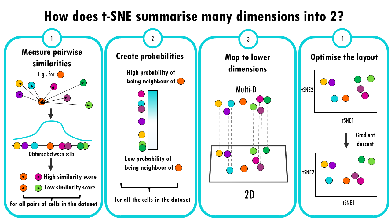
- Measure pairwise similarities: First, t-SNE calculates how similar each pair of cells is to each other. It does this by looking at the “distance” between them, often using a method like Gaussian (normal) distribution. The idea is that if two cells have very similar gene expression profiles, they should have a high similarity score, and if they’re far apart, the similarity should be low.
- Create probabilities: These similarities are turned into probabilities (think of it like a “likelihood” that two cells are close neighbours). The closer two points are, the higher the probability that they are neighbours.
- Map to lower dimensions: Now, t-SNE creates a new 2D space and tries to position the data points there. The goal is to place points so that similar cells in the original space are still close together in the new space, and dissimilar cells are far apart.
- Optimize the layout: This is where the “stochastic” part comes in. t-SNE uses a technique called gradient descent, which is a way of adjusting the positions of the points in the lower-dimensional space step by step, trying to make the distribution of similarities in the lower space match the original distribution as closely as possible.
For further details, see some of these resources:
- Google TechTalk (Duration 55 min.)
- StatQuest! video (Duration 10 min.) The screenshots included above come from here.
- Article at Distill on the effects of parameters.
- 2019 paper summarizing the challenges of t-SNE for scRNA-seq data.
- original paper from 2008.
- biostatsquid
The technical details may be challenging, but the execution in Seurat
is straightforward. Keep in mind that this algorithm has many parameters
that can be adjusted, one of the most relevant is
perplexity (see ?Rtsne::Rtsne for further
details.) This value is our way of telling to the algorithm (loosely)
how to balance attention between local and global aspects of your data.
The parameter is, in a sense, a guess about the number of close
neighbors each point has.
According to the docs, perplexity should always follow:
3 * perplexity < nrow(X) -1.
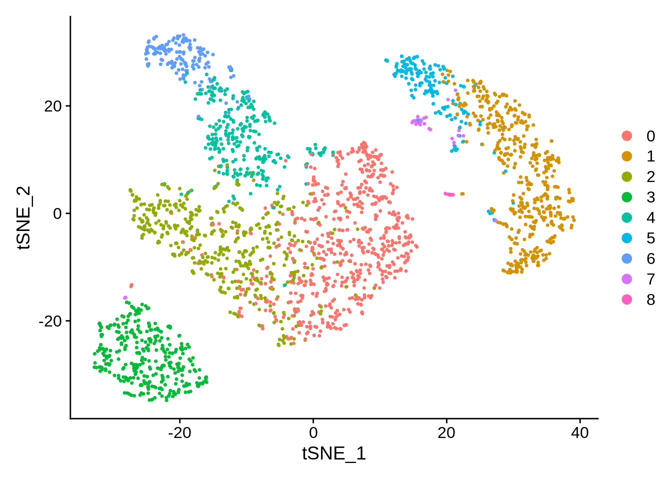
p1 <- pbmc %>%
  RunTSNE(seed.use = NULL) %>%
  DimPlot(reduction = "tsne")
p2 <- pbmc %>%
  RunTSNE(seed.use = NULL) %>%
  DimPlot(reduction = "tsne")
p1 + p2
Conclusion: t-SNE is a stochastic algorithm. It starts with a random projection, and then accommodates the points in the lower dimension by moving them iteratively, guided by the similarity scores (the Student distribution.)
UMAP: Uniform Manifold Approximation and Projection
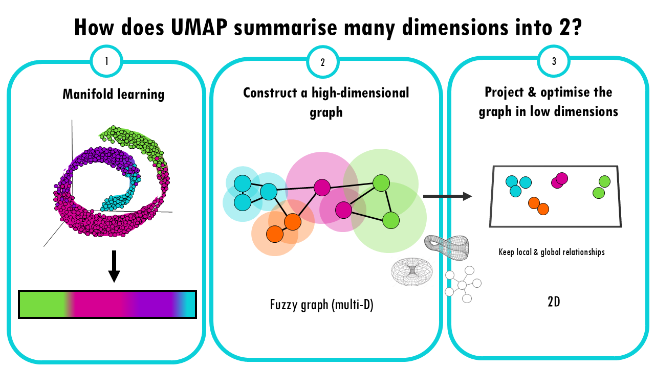
- Manifold Learning: UMAP is based on the idea that high-dimensional data often lies on a lower-dimensional “manifold” (like a curved surface). For example, a 3D object might look like a 2D surface if we zoom in close enough. UMAP tries to learn this manifold structure, but instead of doing it from 3 dimensions to 2, it does it from 10.000 genes to 2 UMAP projections. But the idea is the same.
- Constructing a high-dimensional graph: UMAP starts by creating a “fuzzy graph” which is a high dimensional graph where each data point (in this case, each cell) is connected to its nearest neighbours. So how does UMAP decide whether two cells are connected? We’ll talk about this high dimensional fuzzy graph in just a bit. But for now, just know that with this multi-dimensional graph, UMAP ensures that local structure is preserved in balance with global structure. This is a key difference and advantage over t-SNE. Ok, but this fuzzy graph is still highly dimensional, we need to bring it down to 2D.
- Optimizing the Graph in Low Dimensions: Again, like t-SNE, there’s an optimization step where UMAP optimizes the layout of a 2D graph trying to keep the connections it computed in the multi-D fuzzy graph. Mathematically it is different to t-SNE: t-SNE uses probability distributions, UMAP uses a technique from topology (the study of shapes) to optimize the graph in a lower-dimensional space. The idea of this step is to keep the local neighbourhood relationships, the connections between cells, while also trying to preserve the broader, global relationships in the data.
For further details, see some of these resources:
- McInnes et al. 2018
- Google PAIR from Google’s People+AI Research (PAIR) initiative.
- StatQuest video, the screenshot above comes from this one.
- Parameter Tuning Tutorial on the official Python Implementation (McInnes et al.)
- biostatsquid
UMAP’s hyperparameters:
- n_neighbours controls how much of the local vs global structure is
preserved
- min_dist: minimum distance between points in the low-D space
UMAP has a similar goal as t-SNE; but it also tries to preserve more global aspects of the data structure. It has several advantages:
- faster approximation
- less sensitive to seed
- better balance between local and global structure
Thanks to Seurat, and the underlying package (see
?uwot::umap), finding and plotting the UMAP projection is
also straightforward:
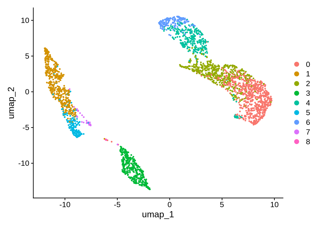
Unsurprisingly there are again many parameters that can change the visualization.
Take Away
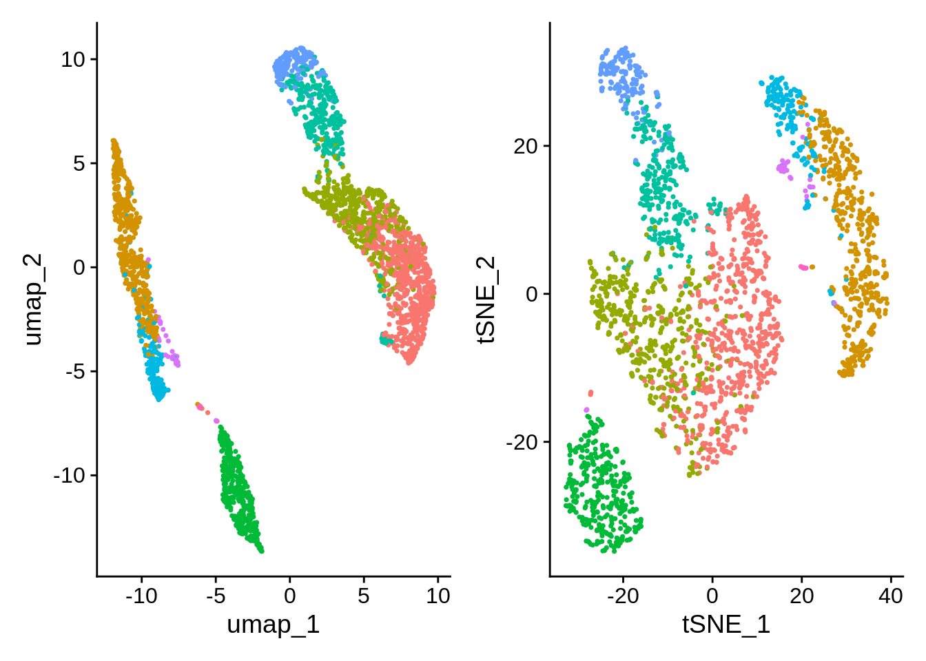
- Global distances and orientations should not be over-interpreted.
- We’re distorting the data to fit it into lower dimensions. Both algorithms aim to facilitate visualization, there is no ground truth.
- Parameter exploration is allowed, and very much encouraged.
End
Optional excercise 1: recalculate tSNE and UMAP projections using 10 PC components. Compare to the original.
Optional excercise 2: grab another example dataset from SeuratData and process it in a similar way. Some help: